Creative Post-Flashing Technique for The Long Goodbye
Variable flashing after photography as a technique for modifying the characteristics of the color negative produces results that are aesthetically exciting, while solving technical problems.
Exposing your negative to varying amounts of light after you have shot it and before you have developed it, without being precisely certain what the results are going to look like, wouldn't seem like a technique designed to reduce the anxiety level of a cameraman shooting a major feature, or to ensure a good night's sleep for the director or the manager of the laboratory responsible for these shenanigans. But it worked exceptionally well for director of photography Vilmos Zsigmond, director Robert Altman and Technicolor, who used variable flashing as a technique of modifying the characteristics of the color negative during the shooting of The Long Goodbye. It produced results that are aesthetically exciting, while solving technical problems that could have been handled other ways only at much greater cost and developed methods to adapt color emulsions to a much greater range of lighting situations.
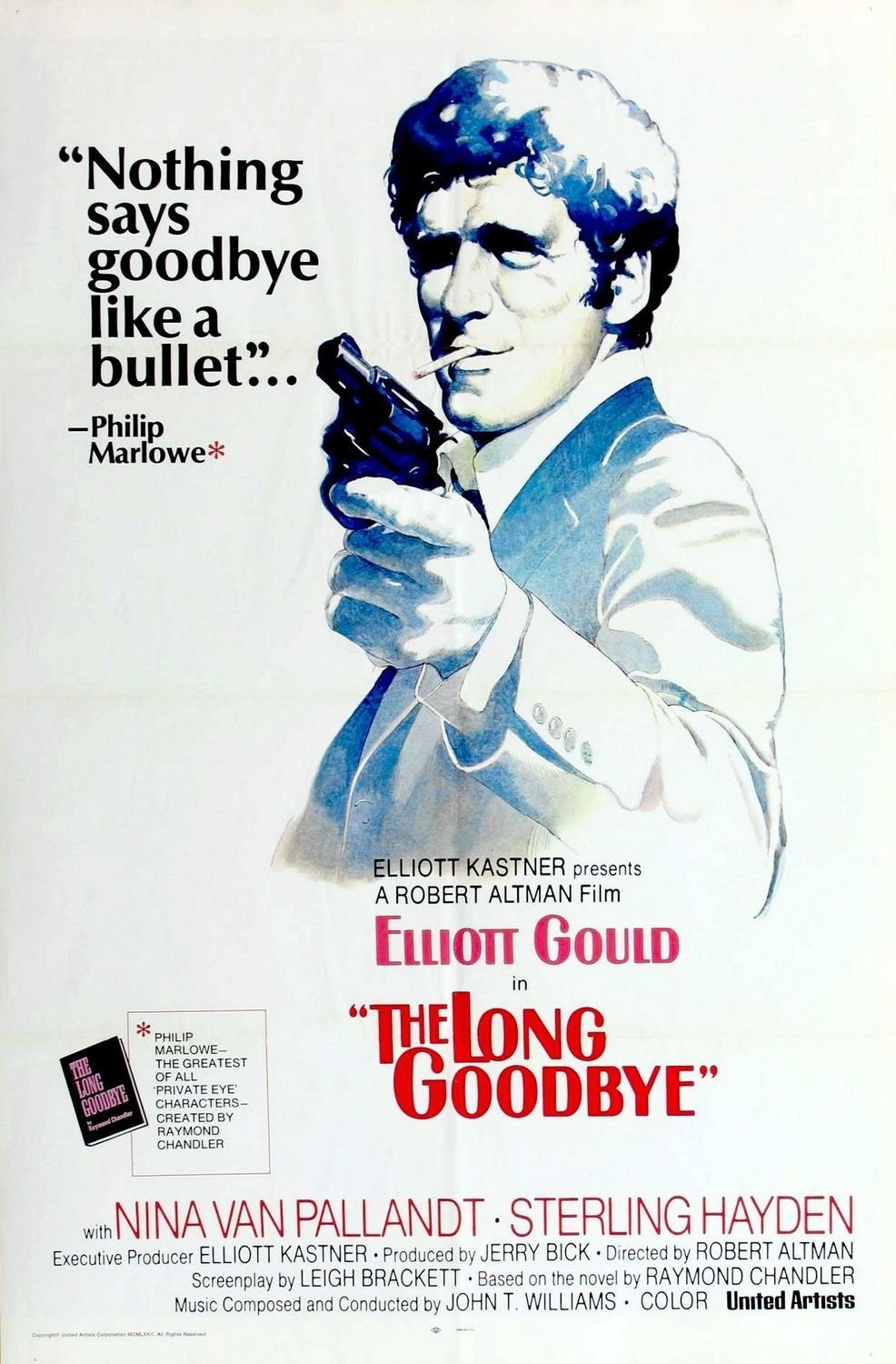
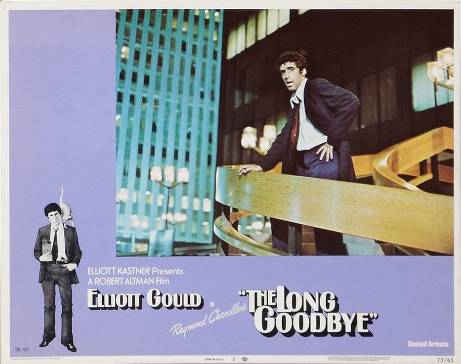
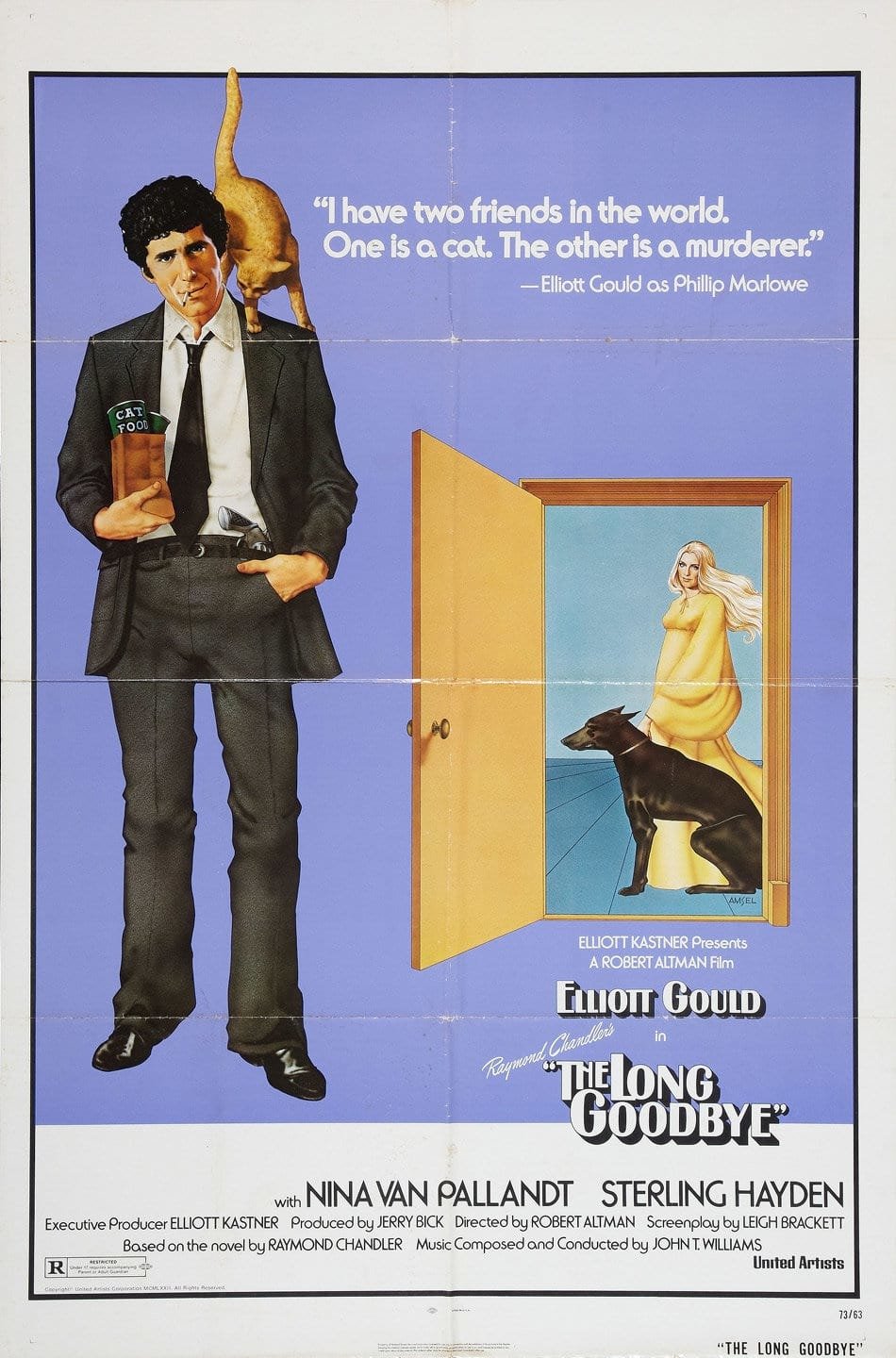
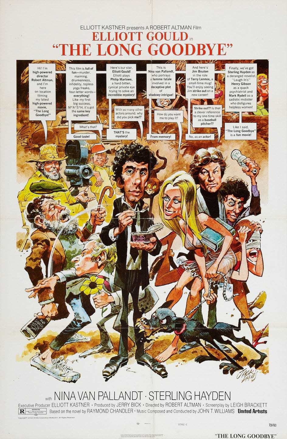
The Long Goodbye is, of course, based on Raymond Chandler's best-selling work of the same name, and continues the adventures of his detective hero Philip Marlowe, private eye in the well-known tradition, and one of the fictional and movie greats.
Considered one of Chandler's best, and his last important work, The Long Goodbye was published in 1953 and has been a best-seller in the genre ever since. Interestingly enough, it had never been made into a motion picture, and might have slid slowly into obscurity if executive producer Elliot Kastner had not optioned it for the screen. Kastner, who has a long string of fine films to his credit (including Harper, Kaleidoscope, The Walking Stick and A Severed Head), felt that The Long Goodbye was a sure winner, especially in light of the recent successes of such other hard-edged detective pictures as The French Connection, Bullitt and Dirty Harry, and he commissioned producer Jerry Bick to put the project together.
“We were making a today picture, but we wanted the look of 20 years ago. It is very difficult to talk about it in words, but we did not want to re-create the ’50s, but to remember them.”
Robert Altman, a director who has received critical acclaim for his venturesome and visionary undertakings of such diverse material as Brewster McCloud and McCabe & Mrs. Miller, became involved when Bick, in London to discuss his and Altman's upcoming project Thieves Like Us casually mentioned The Long Goodbye and the fact that Elliott Gould might play Marlowe. Altman, who had directed Gould in M*A*S*H, was so intrigued with the combination of story, character and actor that he convinced Bick to delay Thieves Like Us so that he could direct this one.
Upon wrapping Images, which he was then shooting in Ireland, Altman then came back to Hollywood for his first picture here since M*A*S*H,and started prepping the Leigh Brackett script. Leigh Brackett, having previously co-adapted (with William Faulkner) Chandler's The Big Sleep, and authored numerous westerns and thrillers, was a lady well qualified to translate the intense sense of character and place unique to Chandler into the language of the screen.
With the main elements, story and star, now set, Altman began to look deeper. To Altman, the surface of the story, that is, the plot and dialogue, is generally not the most important element. In fact, his actors are given great freedom to improvise on the set dialogue and action that they feel is appropriate to the character and situation. (This presents some interesting photographic problems, as we shall see later on.) He is much more concerned with the non-explicit story — the way that characters reveal themselves in mannerism and in unguarded moments; the way an event is shaped by the uniqueness of its time and place; and how the story takes on a wider range of (ironic) meanings when viewed from a different (modern) perspective.
In McCabe & Mrs. Miller for example, the evocation of time and place, in this case the growth of a mining camp in the Pacific Northwest from a tent city to a permanent town, to a large extent was the story. And when Raymond Chandler created Philip Marlowe, he invented more than just another fictional detective. He set him into a time and place uniquely his own: Los Angeles in the late 1940s and early ’50s.
Those of us who lived in “L.A.” then remember that it was a very different place from what it is now. We lived on the “coast,” in stucco bungalows surrounded by palm trees, orange groves and mountains, not tract houses and smog. We met our arriving visitors at Union Station, not LAX, and took them to Grauman's Chinese to see the stars place their footprints in concrete, not to Disneyland to see an animatronic President Lincoln recite the Gettysburg Address.
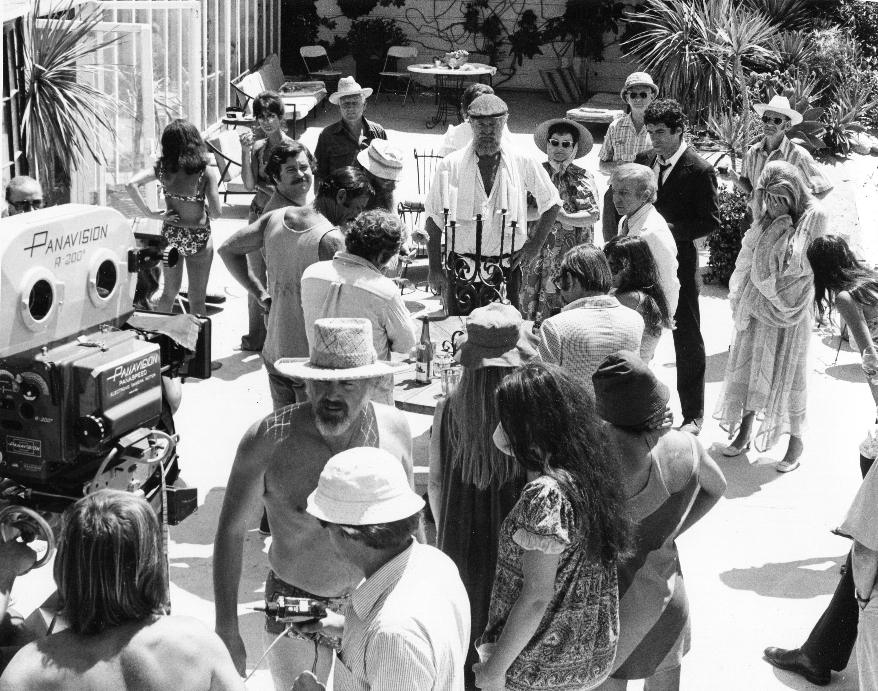
So, the background, too, is a character in the tale, and with this in mind Altman selected all practical locations in both Los Angeles and Mexico. The locations have that gritty L.A. reality that Chandler knew so well, and range from the luxurious Malibu Colony (filmed at Altman’s own beachfront house) to the old Lincoln Heights Jail, a piano bar in the Valley, a Pasadena rest home, and Marlowe's own old stucco hillside apartment behind the Hollywood Bowl. No soundstages were to be used at all.
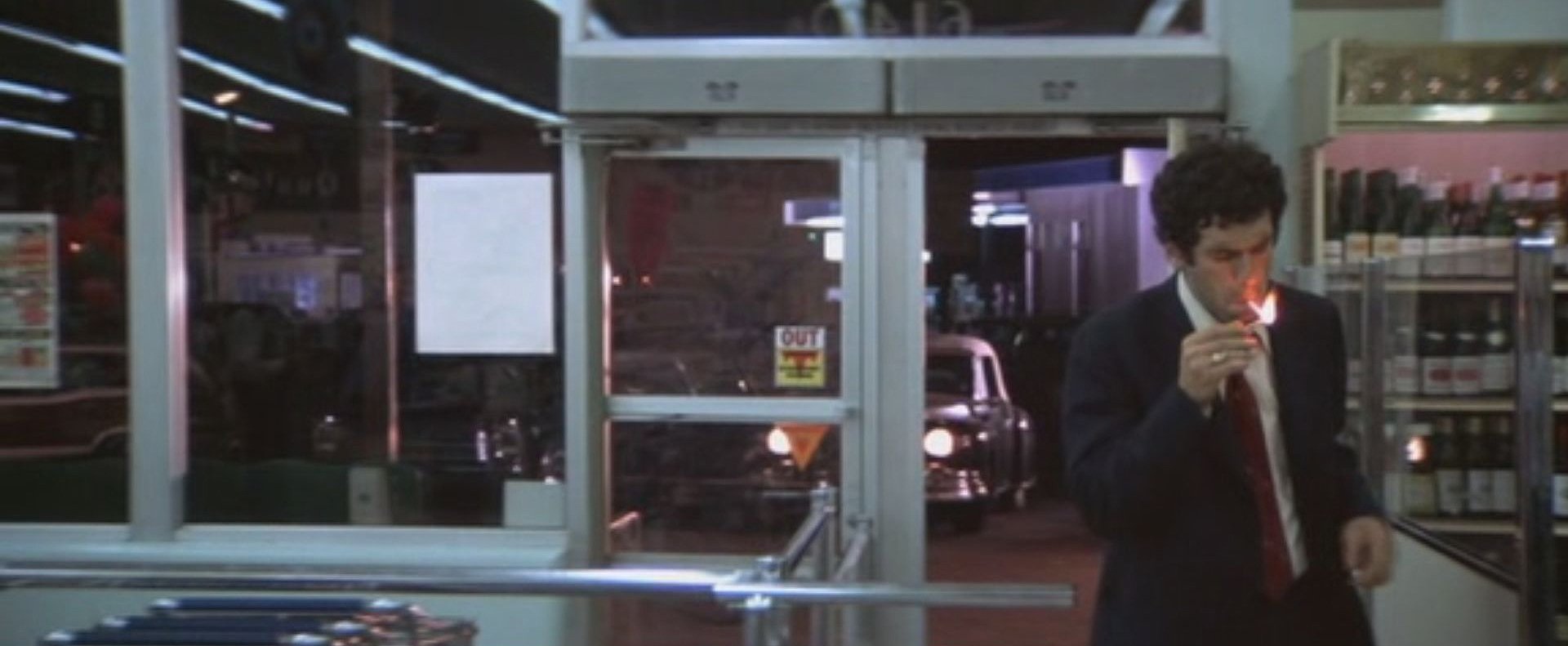
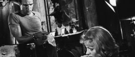
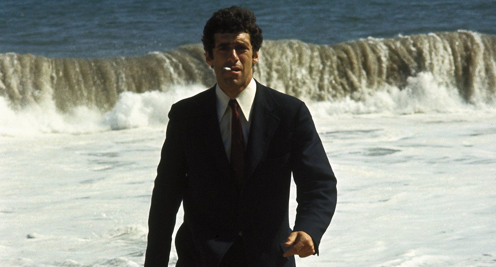
Altman also had a very definite point of view about Philip Marlowe. "Marlowe is a 1950s character who has survived unchanged into the ’70s. He’s a man out of time, and out of place. He wears white shirts, narrow ties, and rumpled blue suits with brown shoes. He is the only one in the whole picture who smokes, constantly puffing on Camels or Luckies. For him, the last 15 or 20 years never happened," explained Altman. Marlowe is a man whose values, morality and style belong to another era, long since gone. This is the unspoken story, to be conveyed visually and non-explicitly, and is as important as the pulse-pounding, action-packed, suspense-filled murder mystery that forms the “real” story.
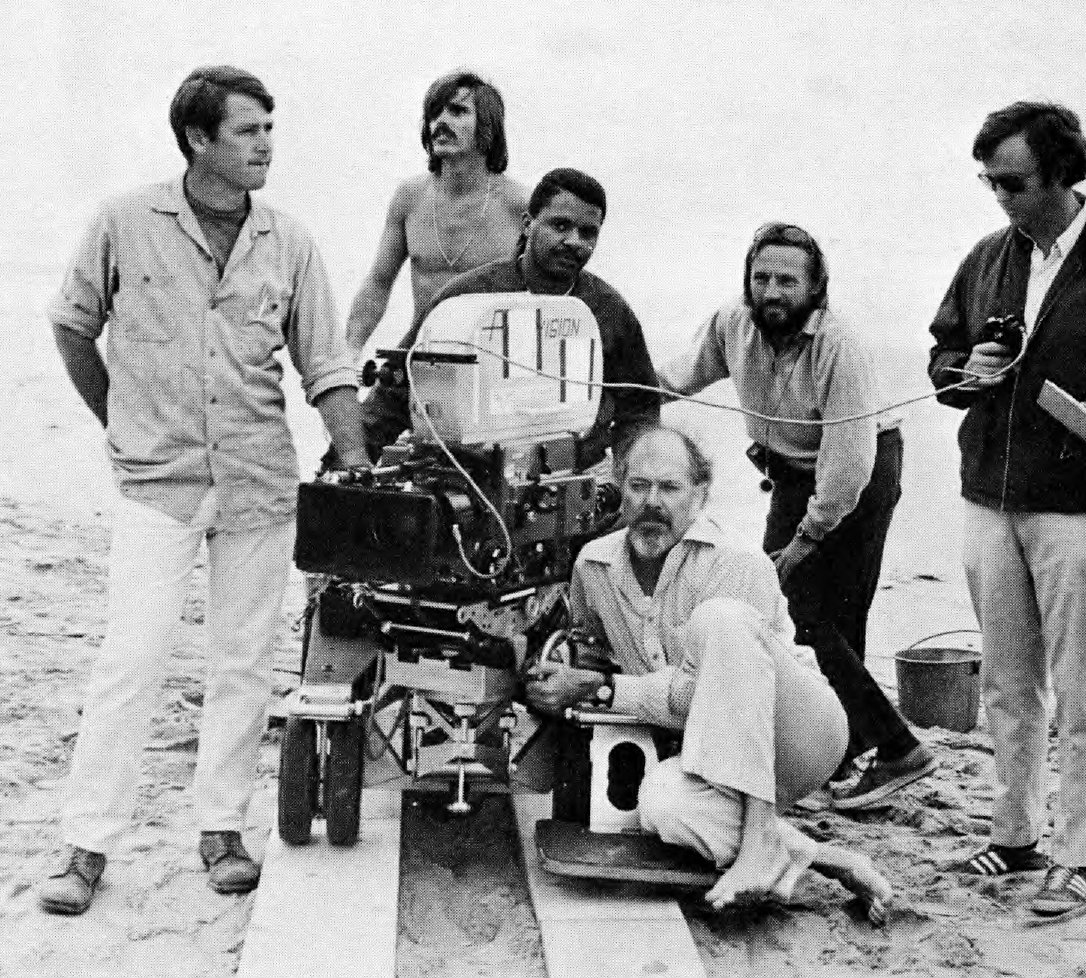
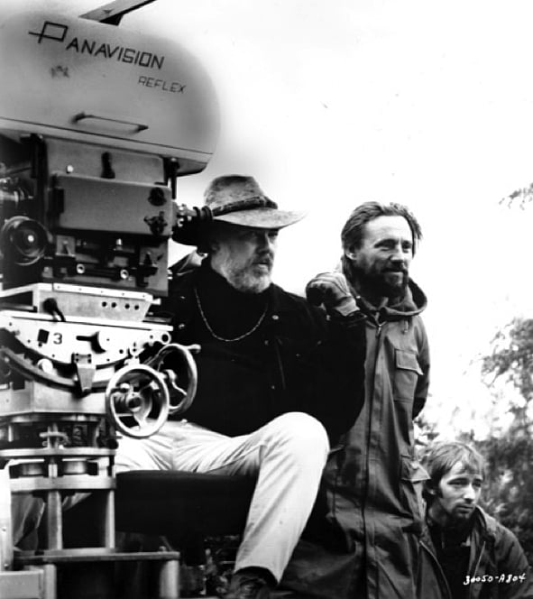
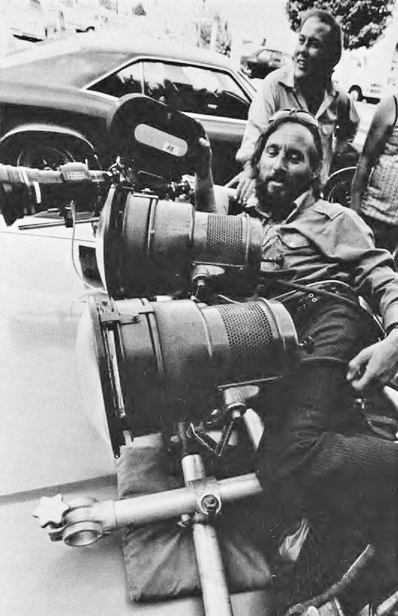
Having posed this interesting set of photographic problems, the question became how to get this idea, this mood, onto film. Altman again turned to one of the most brilliant young cameramen working in Hollywood today, Vilmos Zsigmond. Vilmos and he had worked together on two of Altman's previous films — McCabe and Images — with impressive results.
But neither the faded, flarey, old-time sepia look of McCabe, nor the clarity, introspection, and examination of detail of Images was right for this picture. This was fine with Vilmos, who approaches each picture as a new experience, and tries to create a look that is uniquely right for it.
Zsigmond, along with another gifted Hungarian cameraman, his close friend Laszlo Kovacs, had fled the 1956 Hungarian revolution and landed in Los Angeles. After a number of struggling years, their film on modern dance, Lullaby, gained them the recognition that they needed to move into feature work. Most recently Zsigmond has done Red Sky at Morning, The Hired Hand and Deliverance [AC, Aug. 1971], plus the previously mentioned two for Altman.
Vilmos's European background and classical training have served him well, and many times for a picture he will search through the works of the old masters for a painting that comes close to the stylization that he has in mind; not to copy the look, but to have something to show the director, art director, and the lab, so that they can visualize what he has in mind for the film and help him achieve it.
“For this picture, we had a difficult job,” said Vilmos. “We were making a today picture, but we wanted the look of 20 years ago. It is very difficult to talk about it in words, but we did not want to re-create the ’50s, but to remember them. So what we decided to do was to put the picture into pastels, with a shading toward the blue side. Pastels are for memory."
Vilmos, who probably does not feel that he expresses himself well in his fluent-but-accented English (even though he does), warmed to his subject: “It is also a sad and a funny movie — Chaplinesque. You feel sorry for Gould, and that also works well in pastels. The blue shading in the night effects also will give a feeling of the ’50s. We also did not want to imitate the style of the way pictures were photographed then, except for a few scenes with the gangsters where there is a satiric and ironic quality, a put-on. We used higher contrast with people moving in and out of shafts of light, the way you would remember a ’50s gangster."
But how to achieve this? “The problem is that 5254 color negative is too good. It is too saturated, too perfect. It corrects for mistakes in nature. A blue sky is never that blue, a yellow flower never that yellow,” lamented Vilmos.
The problem was to create pastels the way the eye sees them, or even more so. Vilmos is the first to admit that the cameraman can’t do it all. The production designer, art director and costumer had to eliminate bright colors in the clothing and sets. But that wasn’t enough. The raw stock, Eastman Color Negative Type 5254, still had too much inherent contrast for his purposes. “You can’t just light it flat, because then it looks flat, and not pastel. Also, I did not want to use heavy fog filters and backlight as in McCabe, because that takes away the sharpness, and we wanted the sharpness, but not the contrast,” explained Vilmos.
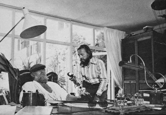
Vilmos took the problem to Technicolor, in the person of the affable Skip Nicholson, Technicolor's Manager of Photographic Services. Vilmos had achieved something like the results he desired for The Long Goodbye in Deliverance, which had a muted, de-saturated look. Technicolor had done the lab work on that film, and without giving away any of Technicolor's trade secrets, the varying degrees of de-saturation of Deliverance were achieved in the printing and did involve a masking step when the Color Reversal Intermediate (CRI) was prepared. This, while it did create what was wanted for Deliverance, was costly, and involved additional handling steps with the original negative, which is always something to be avoided, if at all possible. Most important of all, it was not quite what Vilmos had in mind.
There is a very easy way to solve the problem of contrast if you are working in black-and-white. The contrast of the material is controlled in the development. A longer development time produces greater contrast (higher gamma), and shortening the development time yields a lesser degree of contrast (lower gamma). Appropriate adjustments are made when exposing the material, decreasing exposure when development and contrast are to be increased so that the more dense areas of the negative will not all develop to maximum density (to ensure that the highlights won’t “block up”), and increasing exposure when contrast and development are to be reduced so that the shadow areas, the “thin” parts of the negative, will have adequate density. But with color emulsions the development time parameter can vary only within very narrow limits; otherwise, unacceptable color shifts take place which cannot be satisfactorily corrected in the printing
Zsigmond decided to experiment with one other way to control contrast in-the-negative, and that was by flashing. (Flashing is providing an additional amount of overall exposure to the negative, either by pre-exposing it to a controlled amount of light before exposure or post-exposing it after exposure.)
But how does flashing control contrast? First, let’s define contrast (for the purposes of this discussion) as the ratio between the highest and lowest density. Let's say the ratio of the highest to the lowest density for a normal scene photographed and developed normally is 100:1. If we add one unit of density overall to the negative by flashing, the new ratio is now 101:2, or approximately 50:1, a reduction of 50% in the overall contrast.
This process is analogous to adjusting lighting ratio by the addition of fill light, where the addition of the fill does not change the basic exposure of the scene but changes the brightness ratio between the lighter and darker areas to a more manageable or desirable one. In addition, flashing tends to make all the colors more pastel, as it adds an overall white light to all areas, thus lightening the values of all of the colors.
Flashing is not a new technique and has been in use for many years. Freddie Young [BSC], for example, used pre-exposure seven years ago, in photographing The Deadly Affair, and it goes back even further than that, with its roots in black-and-white still photography. But Vilmos has added a few new wrinkles. He is post-exposing the film to variable amounts of light, the amount of flashing being determined after shooting and dependent on the original conditions of the scene and the lighting used. He had previously used a form of the technique in photographing Altman's McCabe & Mrs. Miller, probably the first American film in which post-flashing was applied as a means of contrast control.
It is truly incredible — the marvelous softening effect that flashing has upon the film. Skip Nicholson, who had some understandable reservations in the early stages of the project, says now, “I fell in love with it.” And after viewing the dailies, it's hard not to. The image is bright, sharp and well-defined, and yet it is soft, pasteled and muted at the same time. The final scenes in the picture, shot in a forest in Mexico, are done with 50% flash, and have an almost surrealistic quality about them.
This brought up the point about what was meant by “percentage of flash.” How was it being measured and controlled? “Percentage of flash is somewhat relative, but is generally a certain percentage of the original camera photography,” explained Nicholson
Extensive testing was done before shooting commenced under widely different lighting situations of night and day, high- and low-key lighting. “In our testing we started with the working definition that the percentage of flash is the percentage of increase in the density of the most dense portions of the negative over what it would have been without flashing,” Nicholson said.
But as this is relative, depending on the unflashed densities of the original scene, they soon settled on using precise amounts of flash that they could call “10% flash,” “20% flash,” etc.
One result that was immediately apparent as a result of their tests was that different percentages of flash produce differing effects which depend on the type of scene and the lighting used. In night exteriors and other very low-key scenes 10 to 15% flash has a pronounced effect, while the same percentage of flash will produce almost no change in a day exterior or high-key scene. This is understandable when you consider that in a low-key scene, the shadow areas have very low density to begin with, and a small amount of flash produces a great change in density, while with a high-key scene, even the lower densities are relatively high, and consequently it takes a much greater amount of flashing to produce results, density being proportional to the log of exposure.
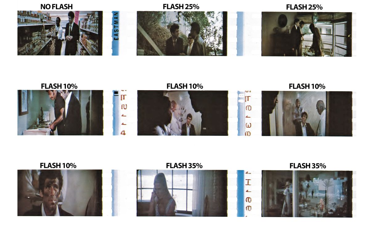
Extensive testing was done before shooting commenced under widely different lighting situations of night and day, high- and low-key lighting. “In our testing, we started with the working definition that the percentage of flash is the percentage of increase in the density of the most dense portions of the negative over what it would have been without flashing,” Nicholson said.
But as this is relative, depending on the unflashed densities of the original scene, they soon settled on using precise amounts of flash that they could call “10% flash,” “20% flash,” etc. One result that was immediately apparent as a result of their tests was that different percentages of flash produce differing effects which depend on the type of scene and the lighting used. In night exteriors and other very low-key scenes 10 to 15% flash has a pronounced effect, while the same percentage of flash will produce almost no change in a day exterior or high-key scene. This is understandable when you consider that in a low-key scene, the shadow areas have very low density to begin with, and a small amount of flash produces a great change in density, while with a high-key scene, even the lower densities are relatively high, and consequently it takes a much greater amount of flashing to produce results, density being proportional to the log of exposure.
Following this initial testing no tests were done on individual sequences after principal photography began, but by that time Vilmos had a pretty good idea of what to expect and, depending on what the lighting conditions were on any particular day, would specify what percentage of flash was to be applied to a particular roll.
Flashing has the added benefit of bringing out shadow detail where none was visible before. Areas in shadow, that had received some exposure, but not enough to lift them off the bottom of the sensitometric curve to the point to which they would print as something other than an undifferentiated black, with the addition of a little extra exposure, were now lifted high enough onto the curve to the point where they would separate out and print nicely.
This application of flashing to increase shadow detail was used to great advantage by Zsigmond in shooting many of the night exteriors. “Present-day budgets don’t allow for the use of much fill light in shooting night exteriors,” explained Zsigmond. The use of extra generators, arcs, and lamp operators makes shooting large street scenes at night a costly proposition. The trend of late has been to push the film one, two, or even more stops in the development. But Technicolor doesn’t believe that you can push 5254 more than two stops without a definite loss in quality. And to Vilmos a two-stop push had the disadvantage of an unacceptable increase in contrast as well as causing any practical lights in the scene (such as auto headlights), to photograph with a noticeable flare.
What Vilmos did was to add a 10% flash and push the film one stop in the development. This had the overall effect of a two-stop increase in speed. The increase in shadow detail was remarkable, and there was no loss in the quality of the image or any unacceptable flare. Vilmos is very enthusiastic about this technique and predicts that it could become the norm for low-light-level shooting that requires forced development. Nicholson has an additional comment on this. “While forced development does increase contrast, it also increases the fog density of the film over what it would be with normal development. This increase in fog density is in effect a chemical flash and so we use a very small percentage of additional flash.”
They both caution anyone using this technique to be very careful not to flash too heavily when trying for shadow detail. If the negative ends up even slightly overexposed, necessitating “printing down” the positive, all the benefits of flashing will be lost.
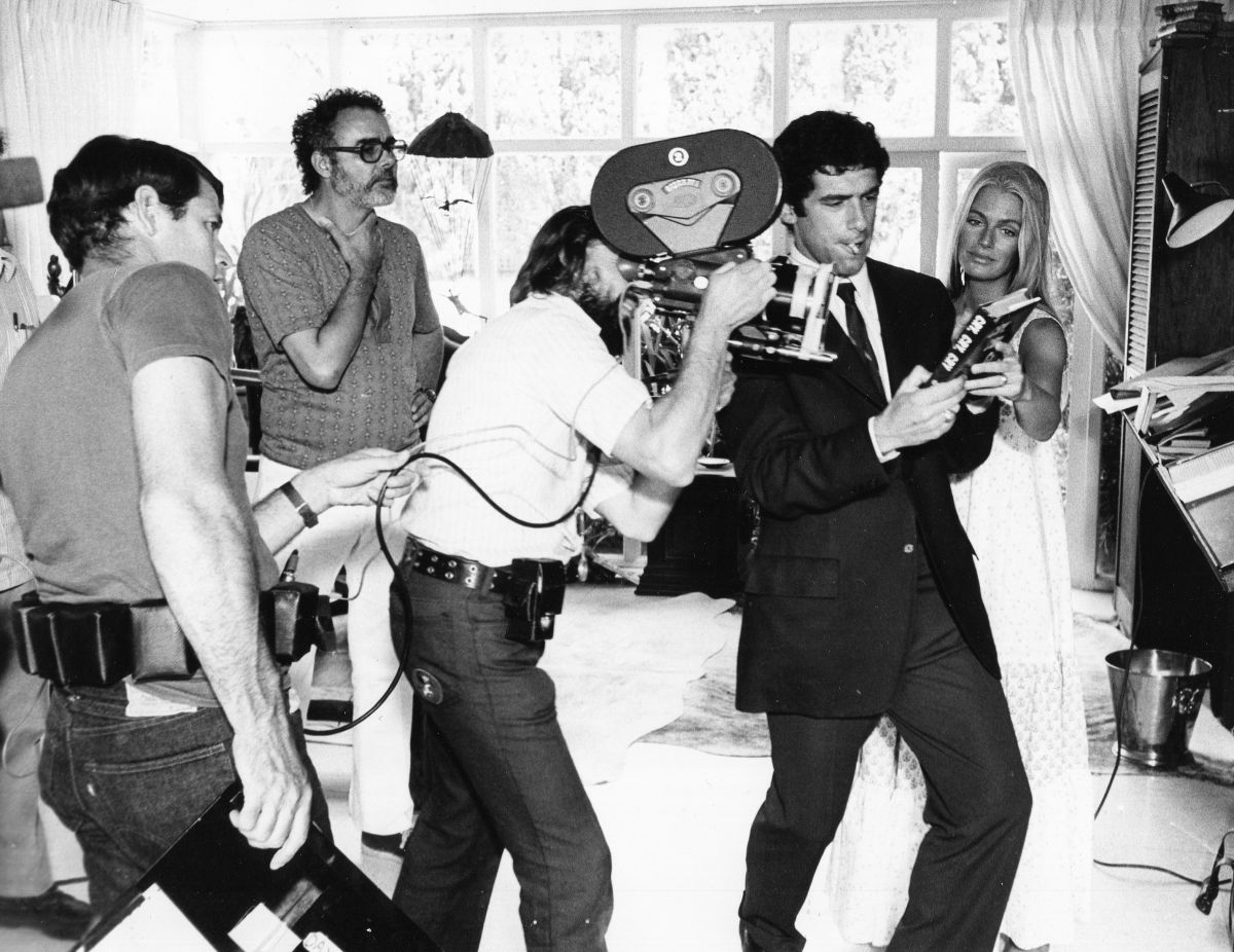
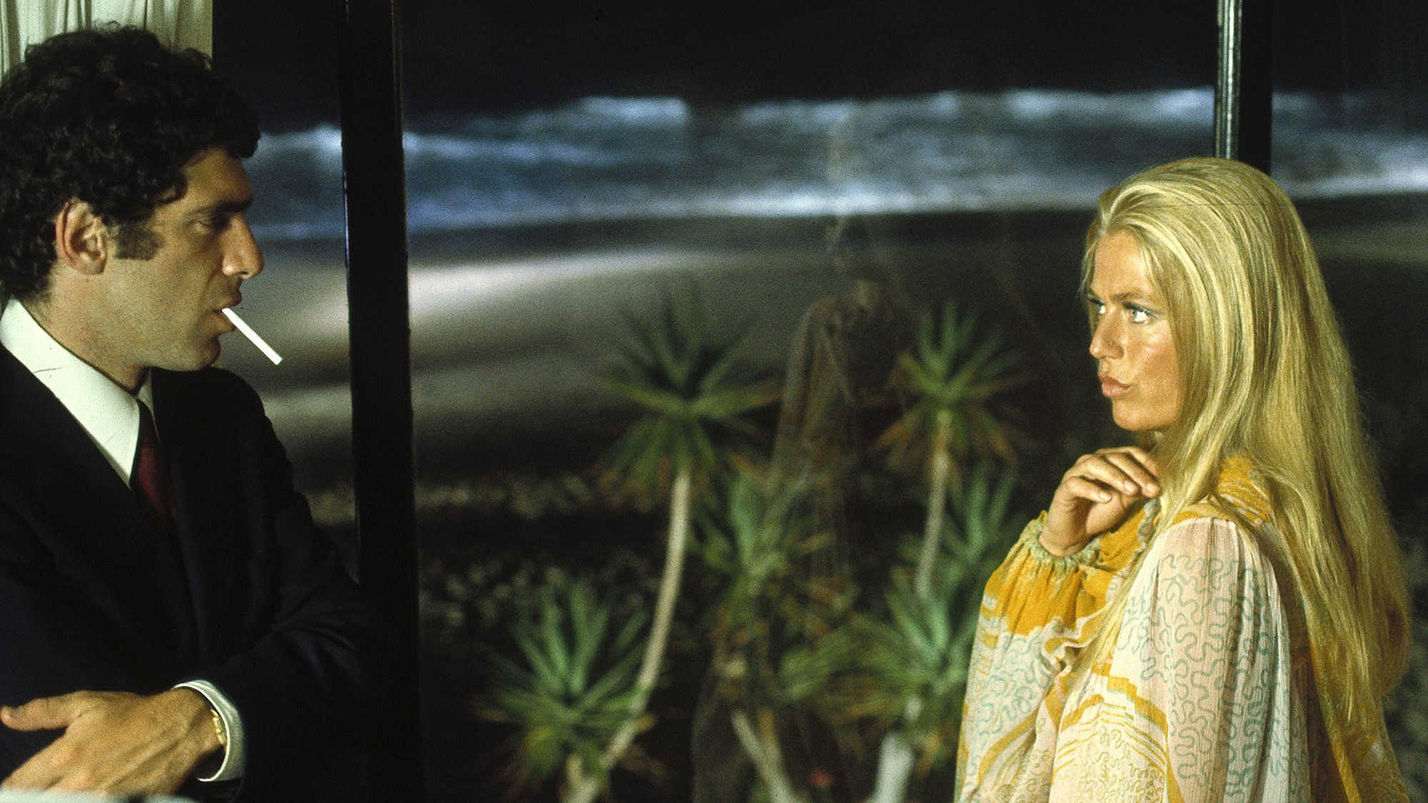
On the other end of the scale, flashing helped Vilmos solve an even more tricky problem. There is a party sequence in the film that takes place on the beach-side patio of the elegant home of Rodger and Eileen Wade, played by Nina Van Pallandt and Sterling Hayden. It was necessary to photograph the party on the sunlit patio, seeing into the shadow detail inside the house, and all in the same shot swing around and photograph the beach and ocean. All on a sunny day! The latitude required as tremendous, and flashing alone wouldn't do it. Vilmos elected to overexpose the film by three stops, flash it 35%, and cut the development time in half. This greatly lowered the gamma of the film, and he was able to hold detail from the bright highlights to the depths of the shadows. Of course, the highlights looked a little strange, and there was a color shift which was compensated for somewhat in the printing. The 50% cut in development only compensates for two stops of overexposure, the third stop being handled in the printing, as any less development would have caused an uncorrectable color shift.
Vilmos philosophically explains that for most purposes the sequence would appear to be unacceptable, but it does have the look of a pastel fantasy newsreel, which is what Bob Altman and he had in mind all the time. Be that as it may, the results, in terms of stretching the color negative to almost its ultimate limits of latitude, are impressive.
There was one other aspect of Vilmos's work on The Long Goodbye that fascinated us as we watched him. And that was the constant movement of the camera. Every shot was a moving shot. The camera was constantly in motion, slowly dollying back and forth along the track without apparent rhyme or reason during both the masters and the close-ups. Vilmos admitted that the moves were only occasionally legitimate, i.e., justified by the action. He maintained that these slight moves, coupled with very slow zooms in and out, gave a feeling of improvisation and a three-dimensional quality as objects and people changed their relationships to one another. He likened it to a controlled hand-held or cinema-verite technique.
Altman improvises a lot on the set, and the coverage shots may find the camera in a different position, or moving in a different direction from that of the master, causing the editor to cut from a right to a left move, for example, or to a non-matching action. Although he admitted that most cameramen will find it obtrusive and pretentious, he urged them to see for themselves. Vilmos feels that it is not obtrusive if the speed of the move is slow, and that the movement will help the picture. “The audience will like it better because it's not perfect. The ‘mistakes’ are making it better,” he maintained.
At the end of our discussion, Vilmos casually mentioned that he always tries to shoot so that even with flashing all the negative would print at about the same printer light. “If you just try to control the gamma, and not worry about matching the density from shot to shot, the change in printer light will mess you up,” he said.
Nicholson goes into greater detail on that point: “Because flashing adds another variable, it is vital for the cinematographer to maintain very accurate scene-to-scene exposures. Since an entire roll is flashed without consideration for scene-to-scene changes, any great degree of exposure variation will cause an increase or decrease in the desired flashing effect. Whereas an unflashed negative can be timed scene to scene and thus produce a uniform final print, the flashed negative can appear to ‘bounce’ if scene-to-scene correction of density is too great. A one-half-stop variation should be considered the maximum to produce the most pleasing result. Vilmos's ability to maintain this scene-to-scene consistency enabled us to do as good a job as we did."
In this respect Nicholson compared Vilmos' work to Gordon Willis' on The Godfather. “Our answer print on The Godfather for Gordon was a one-light print. Now, that's consistency. And Vilmos is very consistent also.” He went on to emphasize that because of this and other personal factors, what Vilmos did on The Long Goodbye is applicable only to him, and to his work, and is not directly transferable to the work of other cameramen. Although in working with Vilmos Technicolor developed some techniques and approaches that may be useful to other cameramen in other situations, he cautions against anyone trying just to imitate the technique without finding out through testing what works well for them.
Zsigmond in turn has nothing but praise for Technicolor and the help they gave him. Together they’ve created a highly original and unusual look for The Long Goodbye that should make it one of the more interesting visual experiences this year.
The cinematographer was honored with the ASC Lifetime Achievement Award in 1999.