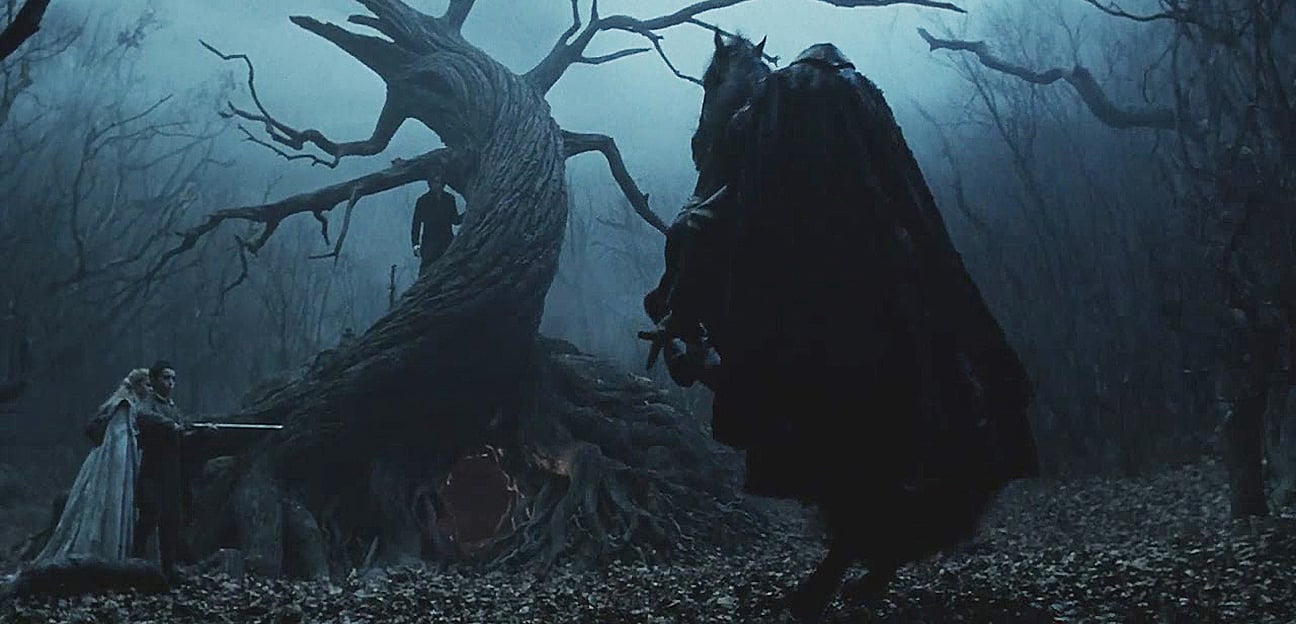
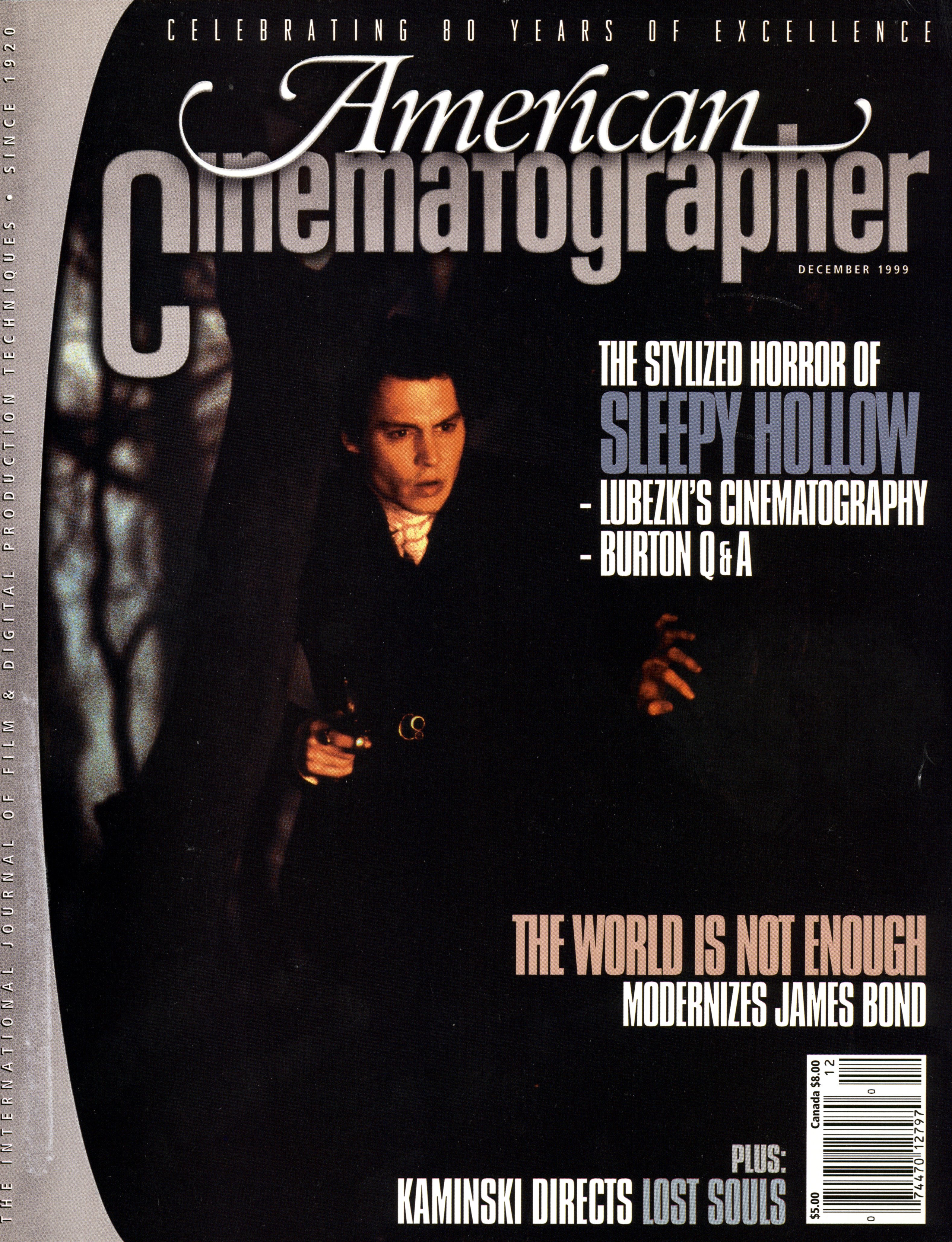
Galloping Ghost: Sleepy Hollow
Cinematographer Emmanuel Lubezki, ASC, AMC teams with director Tim Burton on a sumptuous adaptation of Washington Irving’s famous folktale.
Unit photography by Clive Coote, courtesy of Paramount Pictures.
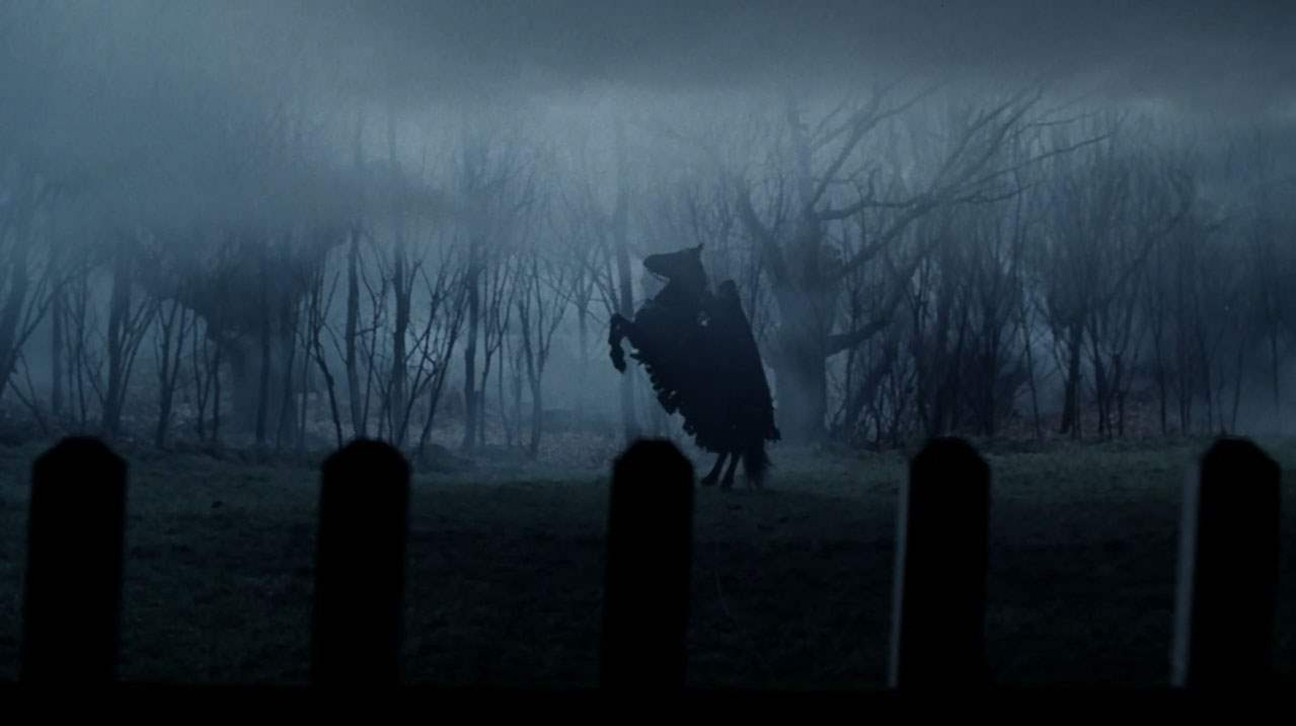
The year is 1799, and an evil aura has descended upon the normally peaceful New England hamlet of Sleepy Hollow. Its townsfolk have grown to dread the sound of hoofbeats, which could signal the approach of a strange and terrifying specter: a headless horseman who decapitates anyone heedless enough to cross his path.
Thus begins Washington Irving’s classic American folktale The Legend of Sleepy Hollow. Penned in 1819, this enduring myth has spooked both children and adults for nearly two centuries. It has also inspired a number of film adaptations; the earliest was Étienne Artaud’s silent 1912 version, but the most famous is Disney’s 1958 animated cartoon.
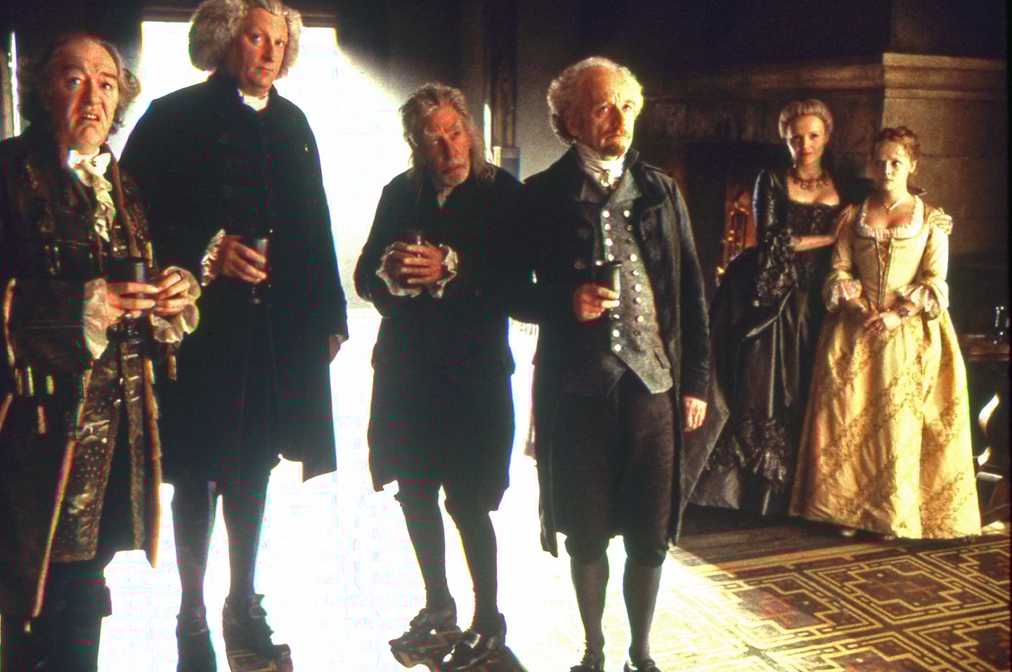
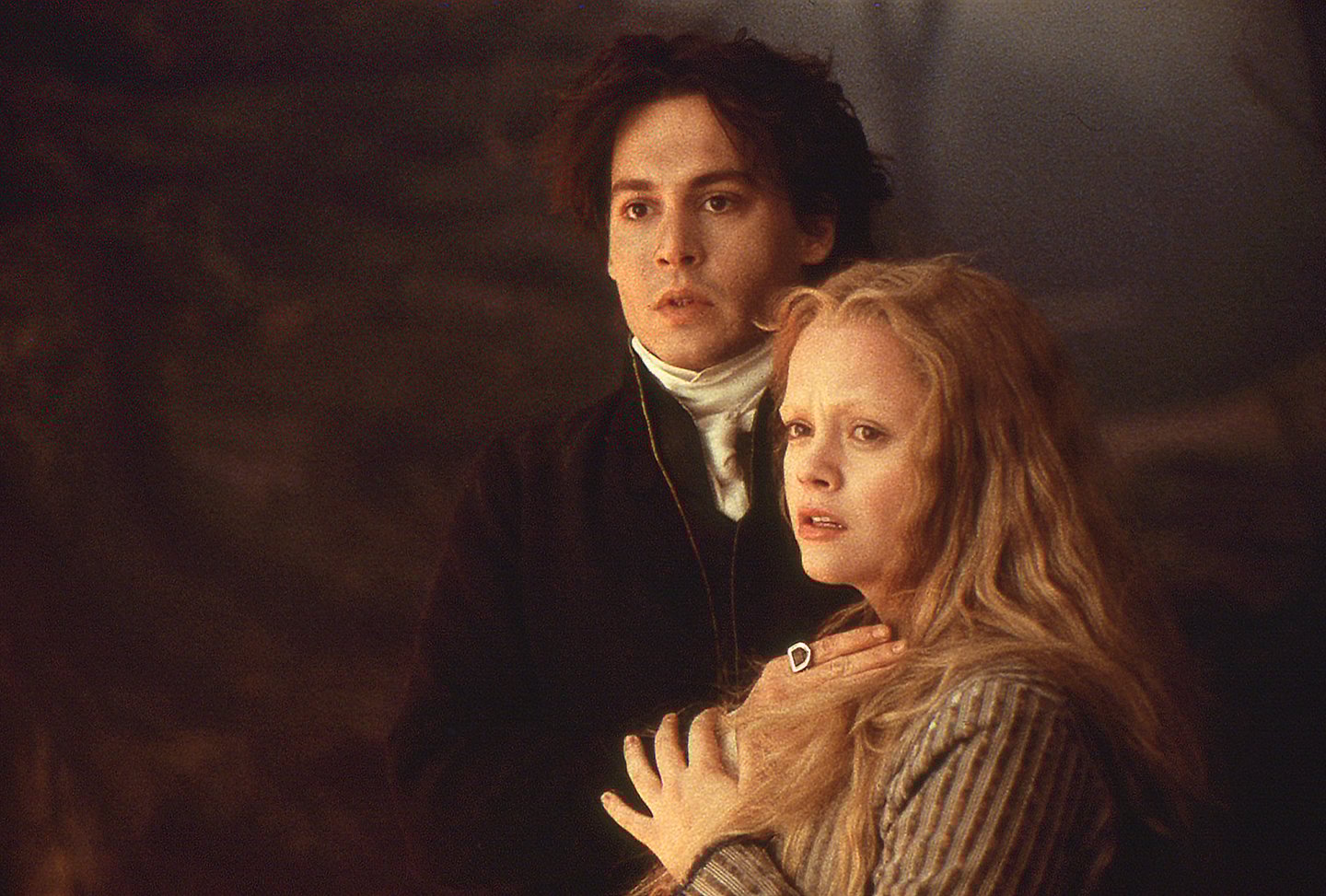
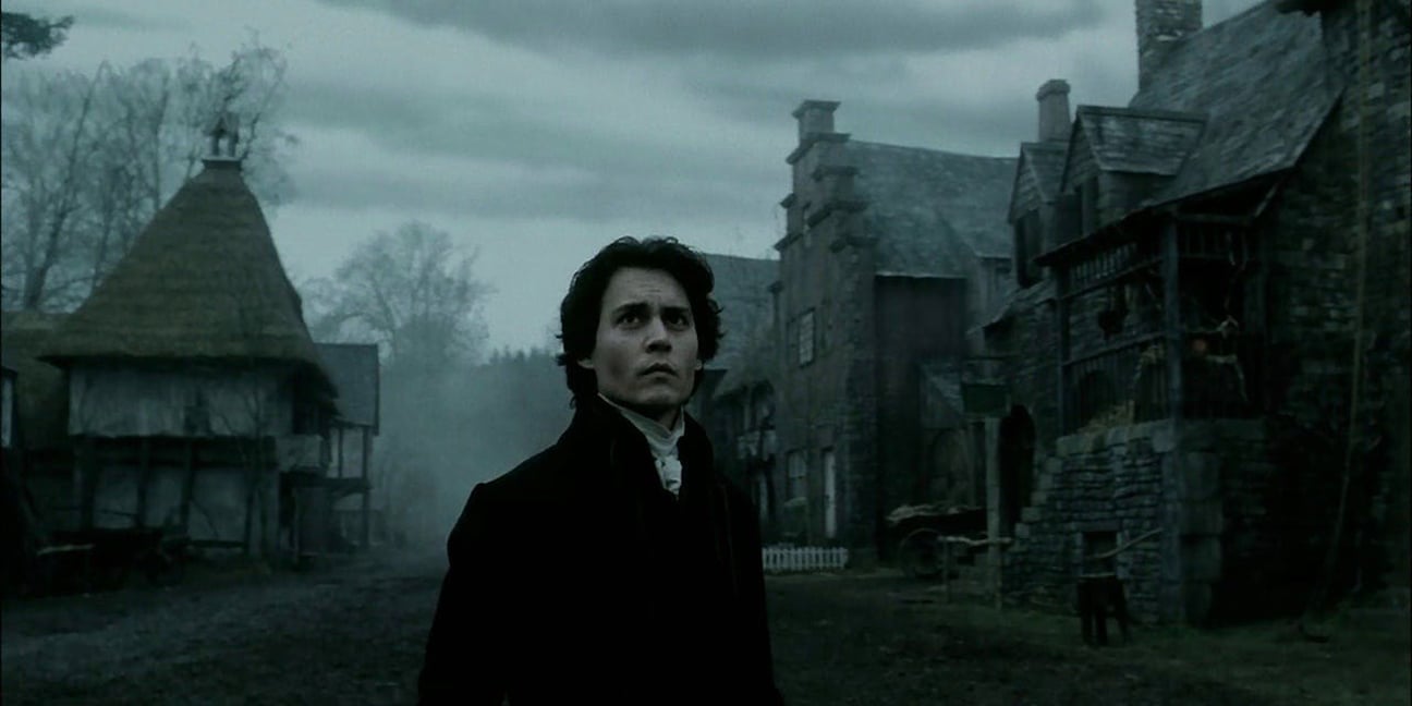
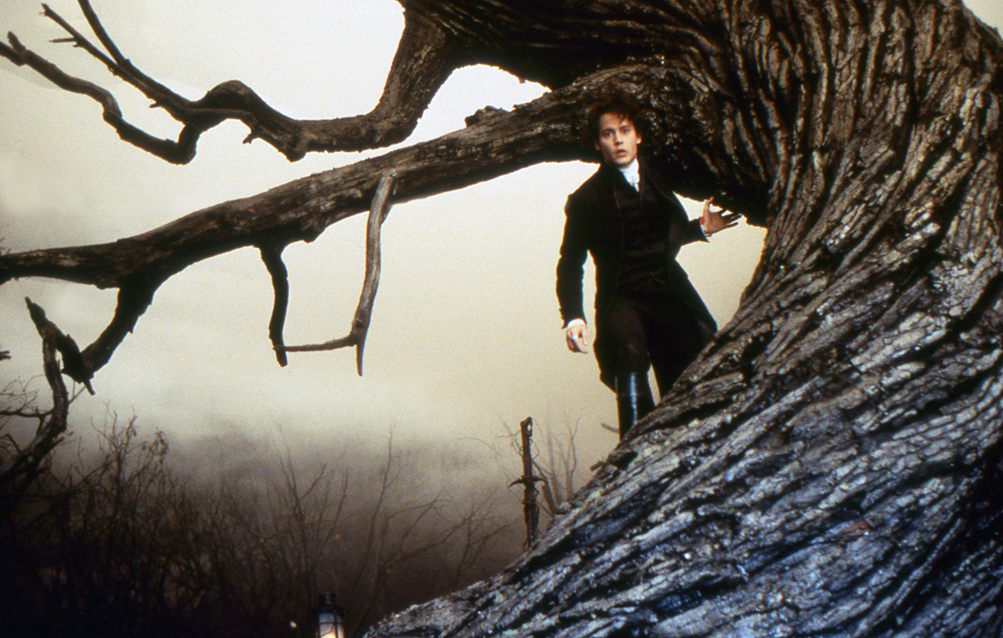
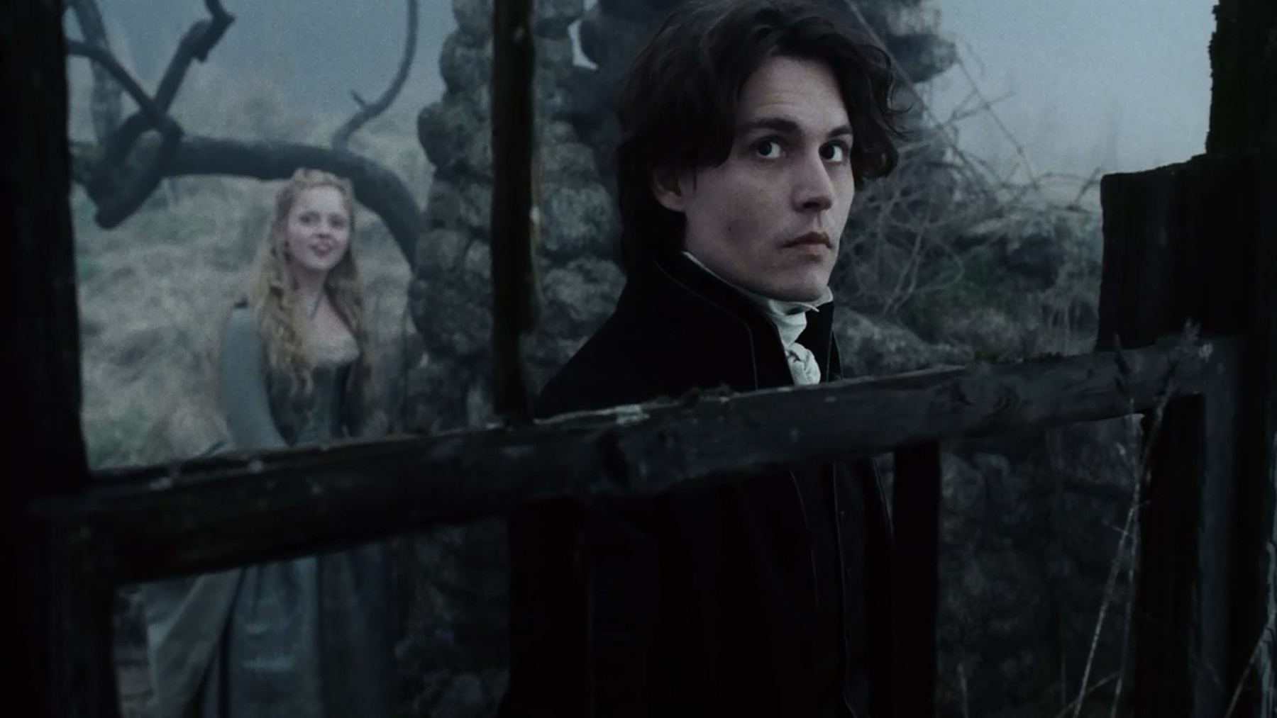
That may change with the release of Tim Burton’s Sleepy Hollow, a highly stylized live-action feature that puts a new twist on Irving’s fiction. In Burton’s take, Ichabod Crane (Johnny Depp) is a dutiful but eccentric constable who uses advanced and somewhat unorthodox methods to solve crimes. His expertise is put to a true test when his superiors send him off to investigate the recent spate of eerie occurrences in Sleepy Hollow. After his arrival, Ichabod falls for the fetching Katrina Van Tassel (Christina Ricci), the daughter of the town’s most affluent family. He soon finds himself vying for Katrina’s hand with Brom Van Brunt (Casper Van Dien), under the watchful eyes of the young lady’s parents, Baltus Van Tassel (Michael Gambon) and Lady Van Tassel (Miranda Richardson).
If ever a story seemed tailor-made for a specific director, Sleepy Hollow was it. Burton fell in love with the script (see interview linked through here), and his creative sensibility seemed ideally suited to the material. Respected throughout the film industry as a truly imaginative visualist, the director sought to imbue his latest picture with the spirit of the classic horror movies he adored during his youth.
Intent on fashioning a Gothic atmosphere leavened with lyrical romanticism, Burton hired Mexican director of photography Emmanuel Lubezki, ASC, AMC, a rising star in cinematography circles. Known affectionately throughout the industry by his nickname, “Chivo,” Lubezki has demonstrated his considerable ability with the strikingly beautiful images and lush lighting he has contributed to the Hollywood films A Little Princess (which earned him both Academy and ASC Award nominations; see AC June ’96), A Walk in the Clouds, Great Expectations and Meet Joe Black. He has also demonstrated versatility by shooting several comedies, including Reality Bites and The Birdcage, and earned three consecutive Ariel Awards (Mexico’s equivalent of the Oscar) for his work on Like Water for Chocolate, Miroslava and Amber.
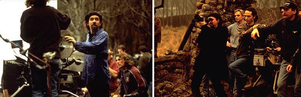
Lubezki was approached about Sleepy Hollow by the film’s producer, Scott Rudin, who was well aware of the cameraman’s sterling reputation. “Scott had already called me about jobs a couple of times, but I was always busy on other projects,” Lubezki reveals. “I really wanted to work with him, though, because he produces great stuff. This time around, he told me he was doing a project with Tim Burton, and naturally I jumped at the chance.
“My first meeting with Tim was incredible,” the cameraman continues. “He told me he liked the script because it was about one guy who lives entirely within his own head, and another guy who doesn’t have a head at all. I wasn’t sure if that idea would be enough to support a whole movie, but then he went on to describe all of these great ‘Burtonian’ images. It was really interesting to see how Tim’s mind works.”
Although Lubezki had gained valuable experience on his previous Hollywood productions, it’s safe to say that Sleepy Hollow was the most ambitious undertaking of his career. “It was definitely a large-scale project,” he confirms. “The day I met Tim, he said he was going to shoot the movie in upstate New York, at the real place that inspired Washington Irving’s story. After he scouted the location, though, he told me, ‘Chivo, forget it, we can’t shoot it there. I don’t want the movie to look completely realistic and naturalistic, like The Crucible.’”
“One of the great things about the movie was making it on very stylized sets. We wanted to find our own reality within a completely theatrical world.”
Burton explained to the cinematographer that he wanted Sleepy Hollow to have a stylized, slightly artificial feel that would pay homage to some of his favorite horror films, which included various titles from the Hammer Films archives, as well as Mario Bava’s atmospheric 1960 chiller Black Sunday. “I was familiar with the most famous Hammer films, like their Frankenstein and Dracula movies, but I’ve never been as big a fan of them as Tim is,” Lubezki admits. “I find them to be funny and a bit campy, which I don’t think Hammer intended them to be. Our biggest frame of reference was Black Sunday. That film is really interesting, because the images are very clear and strong.
“In actuality, I don’t think Sleepy Hollow resembles the Hammer films, except in the way that it was made,” Lubezki maintains. “We did a lot of work on soundstages, and we tried to emulate that ‘classic movie’ feel. The Hammer films were made that way because the filmmakers on those pictures didn’t have a lot of money. We did it because Tim liked the idea of creating a synthetic, pictorial look. Shooting that way also gave us control of the various visual elements, such as the color and contrast, as well as the seasonal elements, like the fog and wind. Tim wanted the whole movie to be in a fall/winter season. We also wanted to control the amount of reality in the movie. It’s not a historical reconstruction, it’s a fantastic tale. One of the great things about the movie was making it on very stylized sets. We wanted to find our own reality within a completely theatrical world.”
“We wanted Sleepy Hollow itself to seem like a very insular community, as if the residents and even the buildings were huddled together in fear, almost like a herd of sheep.”
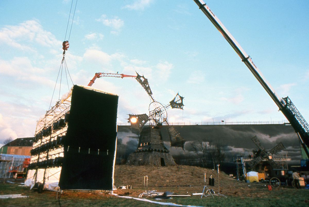
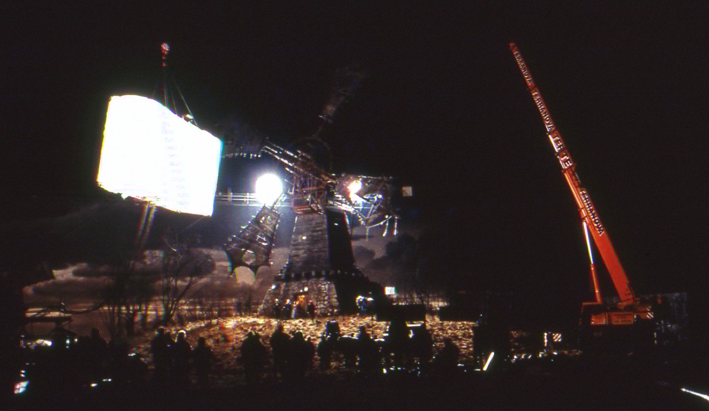
Toward that end, production designer Rick Heinrichs (Fargo, The Big Lebowski) worked closely with his old friend Burton to design elaborate sets — both in soundstages at England’s Leavesden and Shepperton Studios, and on location in Marlow, a small town just outside London. During the preparation stage, Heinrichs constructed a series of highly detailed miniature models depicting the film’s major settings, which include Sleepy Hollow, the spooky Western Woods, a stylized windmill, and various dwellings. “The models helped to capture the texture, the forms, and the colors that we were trying to get in the final sets,” Heinrichs says. “They also gave Tim a chance to see the sets in three dimensions before they were actually built, and to work out the logistics of various scenes. A lot of ideas began at that stage of production, because it’s much easier to deal with miniatures than full-sized sets. For example, if you want to chop something off a building, you can do it without spending $20,000.”
Heinrichs describes the film’s architectural style as “colonial expressionism. The look is not historically accurate, it’s more a mish-mash of various styles. Since the story of the Headless Horseman takes place in a Dutch farming community in upstate New York, the film has a lot of Dutch architectural touches, but we also built some English Tudor half-timber structures with thatched roofs. We wanted Sleepy Hollow itself to seem like a very insular community, as if the residents and even the buildings were huddled together in fear, almost like a herd of sheep.”
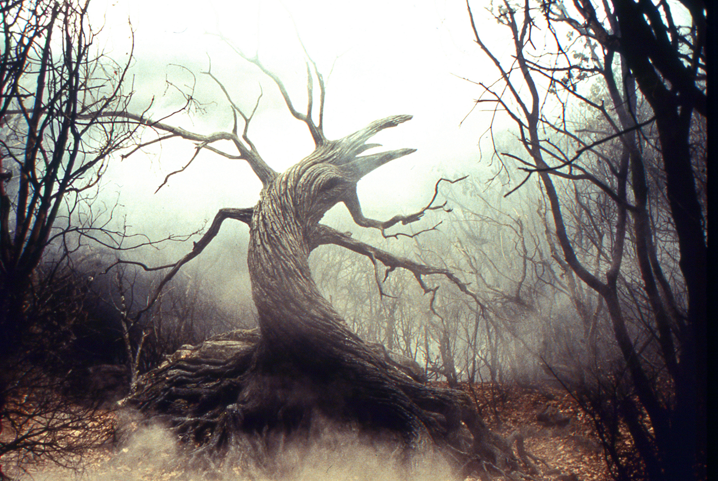
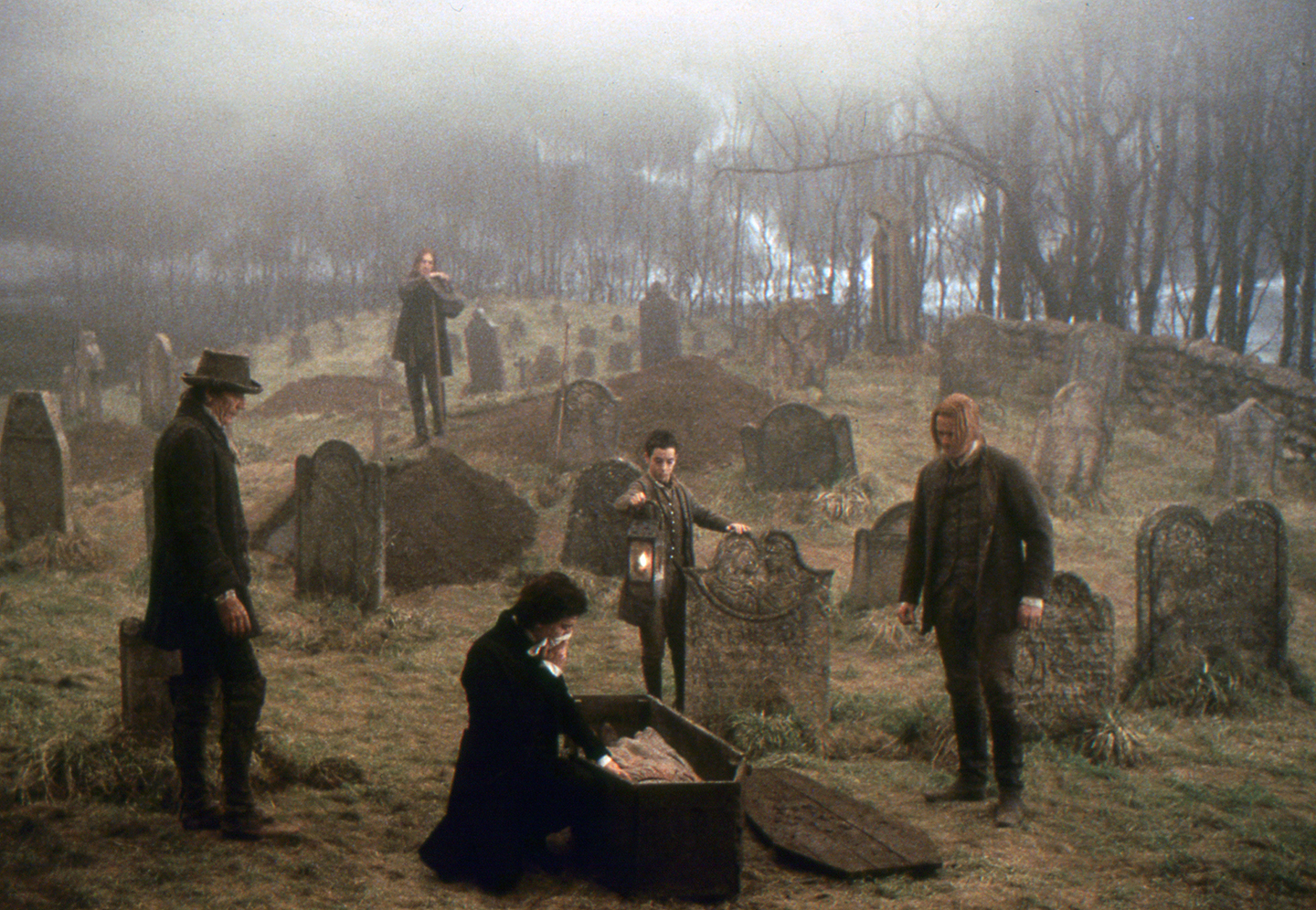
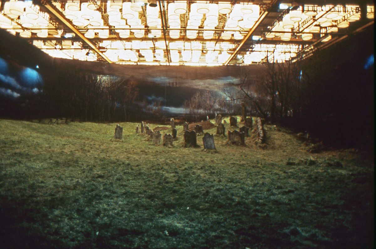
The project’s construction crew included as many as 80–100 artisans during periods of peak activity. The production took up every free inch of space at Leavesden, where sets included the Van Tassel Manor House and other dwellings, a creepy cemetery, and portions of the Western Woods. Stage H at Shepperton housed the rest of the Western Woods, including a witch’s cave and the Tree of the Dead, a huge gnarled landmark that serves as the Headless Horseman’s gateway to hell. Heinrichs notes, “Some of the designs are reminiscent of the old German expressionist films The Cabinet of Dr. Caligari and Nosferatu, which have a very strong, graphic, two-dimensional look within a three-dimensional environment. That’s something Tim and I have always liked to play with in the films we’ve done together.”
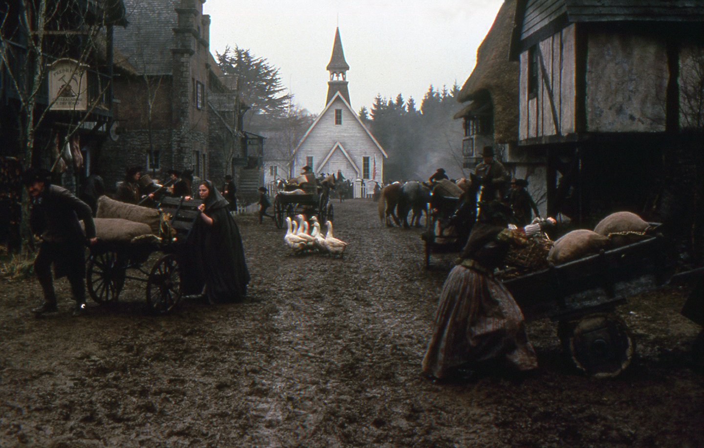
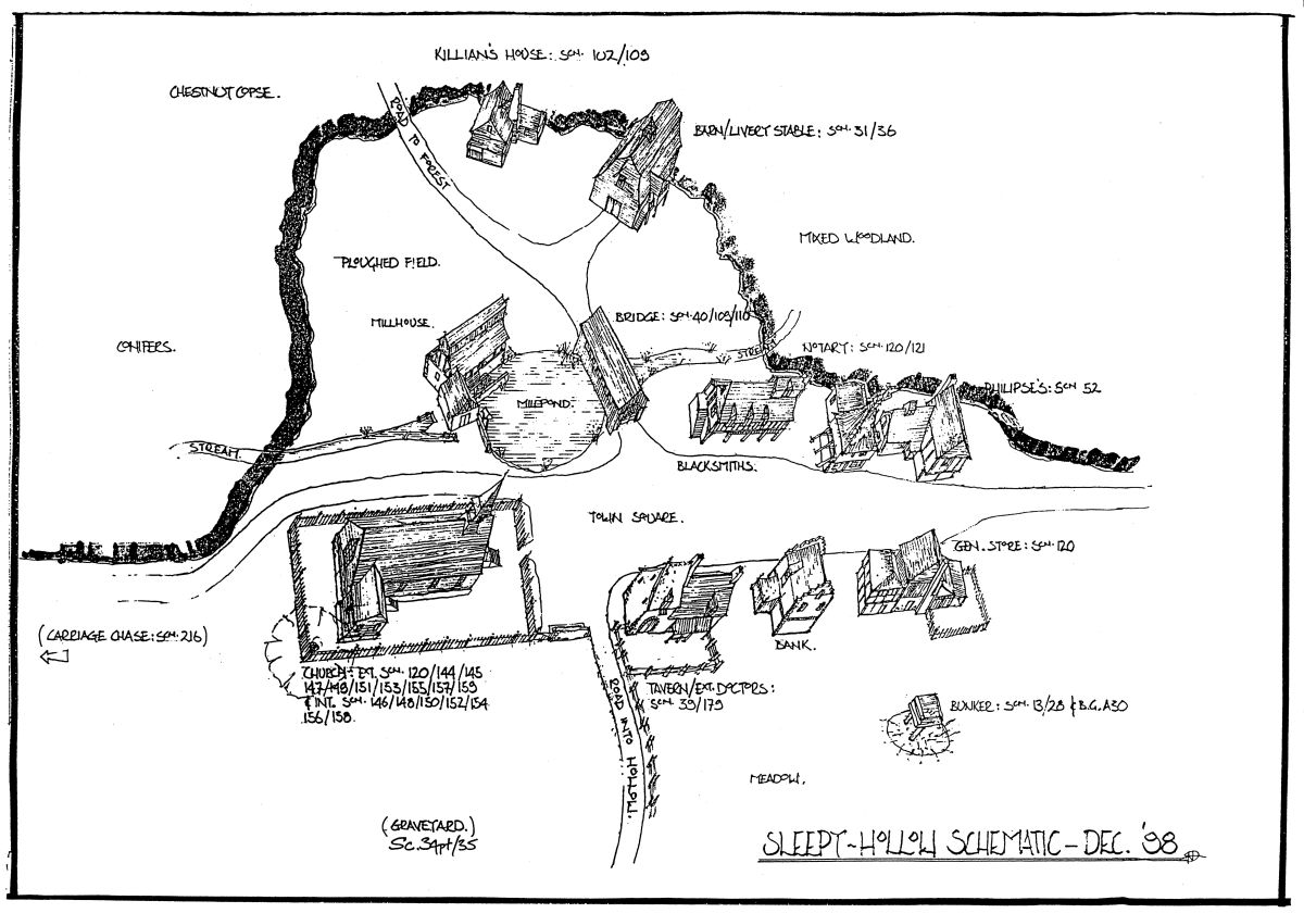
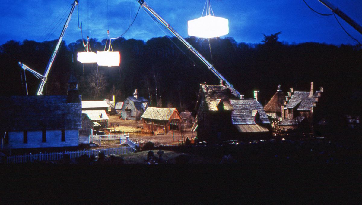
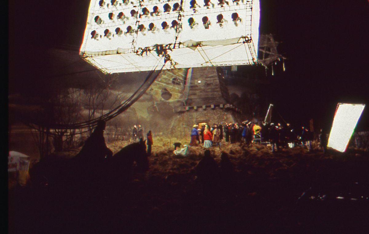
The production designer’s biggest task was the construction of Sleepy Hollow’s town center in Marlow. Nestled in a hunting preserve that came complete with a duck pond, the faux village included everything one might expect from a turn-of-the-19th-century storybook setting: a covered bridge, a church, a blacksmith’s shop, a farmer’s union, a notary public, a halfway house and a general store. During AC’s nocturnal visit to the production in February of 1999, a freezing rain had turned the town’s dirt road into a muddy ankle-deep soup, adding further authenticity to the tableau but causing Burton to catch a nasty cold. Surveying the scene while applying a handkerchief to his reddening nose, the director seemed like a man who might be happy to lose his head to the Horseman’s axe. “Happens to me on every shoot,” he moaned.
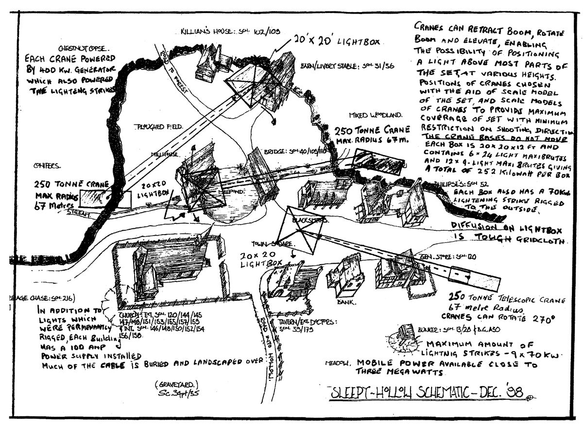
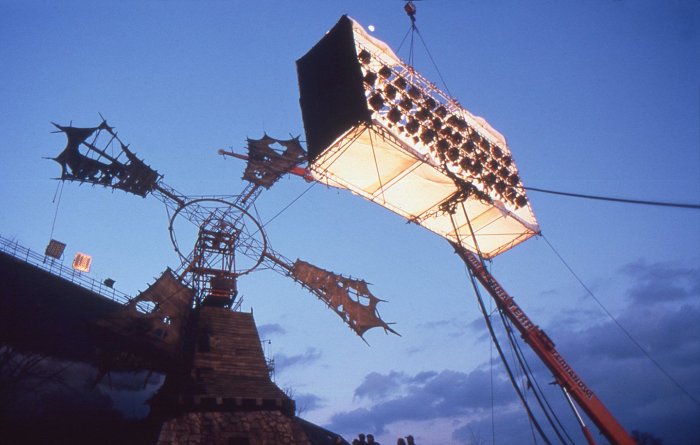
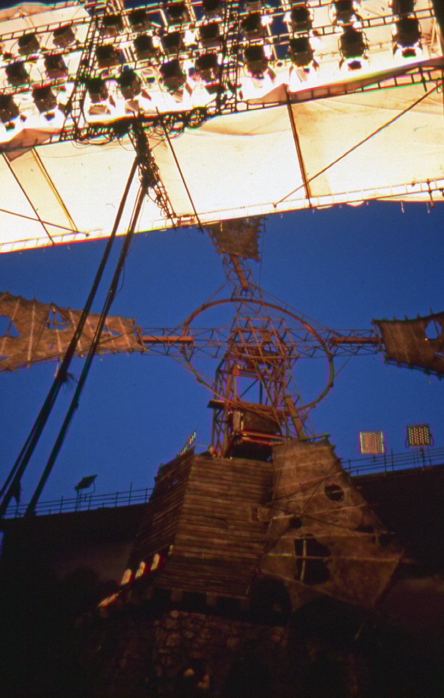
The crew’s grim slog was brightened a bit by Lubezki’s lighting setup, which comprised three giant softboxes suspended from a trio of 250-ton construction cranes. The roof of each unit contained six 24-light (Par 64) Maxi-Brutes aimed downward, while three of the sides contained a trio of 9-light Maxi-Brutes angled at 45 degrees. According to gaffer John Higgins, “Our initial idea for that set was to have a tank-track road ringing the set, and we did tests with various lighting rigs at the positions we could access from the tracks. That idea proved to be impractical for many reasons. Instead, we decided to suspend these very large soft sources on rotating bases that could be positioned at any point above the set and still be kept hidden. The art department built a fantastic scale model of the set, and when we studied it we thought there might be three points where we could position our supports. We eventually located a company that had three 250-ton telescoping cranes with a reach of 67 meters [approximately 220 feet]. The art department then made working scale models of these cranes, which we positioned around the model. This test confirmed that the only way to reach all points on the set was to use three cranes. We then did a test with a half-size version of our rig, which confirmed that our theory would work.”
Each of the completed softboxes consisted of a 20' x 20' base with sides 12' high built from scaffolding. The units had to be strong enough to be suspended safely with the lights attached, and the set’s roads also had to be reinforced to support the cranes’ weight. Each box could provide 250K of light, and full gridcloth was affixed to the bottom and sides of each. Long black ropes were attached to the corners of the rigs so the crew could control their rotation from the ground. The last lamp mounted on the base of each rig was a 70K Lightning Strikes unit, and the power to the rigs was provided by twin 200K generators. The rest of the power for the set was provided by three other generators, while a complete cabling system was wired and then buried during construction of the set. The system enabled the lighting crew to deliver large amounts of power to any part of the set very quickly.
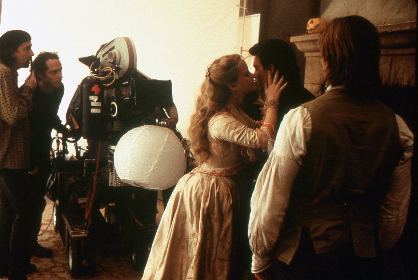
The enormous sources cast a broad, soft glow over the Sleepy Hollow set, lending the picturesque sets an ethereal ambience. Lubezki offered some further insights into the origins of his lighting strategy while hiking up a wet, sloppy path to the set’s hilltop entrance, which was marked by a pair of stone columns adorned with stag’s heads. “I’ve been on this movie from almost the very beginning,” he said. “I usually like to participate a lot in the design process, as I did with [production designer] Bo Welch on A Little Princess. On this one, though, Tim, Rick and the costume designer, Colleen Atwood, were already a team; I was the only new person in that group, so I was more like a pupil who was learning, and I stayed a bit quiet. When I began seeing all of the various models, the first thing that came to my mind was, ‘Stop this insanity, tell Rick to create a window, or to make the ceilings higher.’ All of those instincts of mine were working almost against the process, though, because Tim and Rick were creating very complicated designs. I decided to just sit back and learn from what they wanted to do, rather than throwing out ideas that would be obtrusive. They were open to my suggestions, and they agreed with most of them, such as painting all of the trees inside the soundstages black. But in general, I stood back and listened a bit more than I’ve done on other movies.
“I thought they were joking — all of the stage ceilings were really low, and the sets were less than 20' high.”
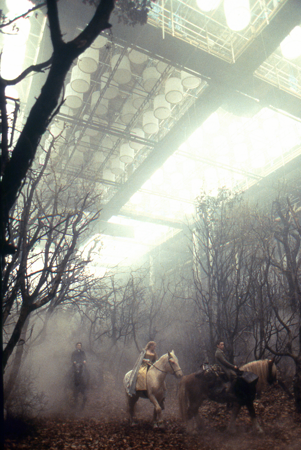
“One day we had a big meeting with everyone, and we talked about building everything at Leavesden Studios. When we went to England on the first scouting trip, they showed me the sets on the stages, and I thought they were joking — all of the stage ceilings were really low, and the sets were less than 20' high. That created some big limitations, and as a result, I had to throw out my initial plans for the lighting. My first idea had been to employ huge sources, most of which would come from the back to create silhouettes, and to use very little fill light. However, the approach I eventually adopted worked out much better: I decided to create a huge toplight, which I had never done before. The stage ceilings were so low that we couldn’t really hide lights in the greenbeds. Instead, we created a huge sense of sky for the exteriors shot in the stages. We installed over 500 space lights up in the ceiling, very close to each other, and then pumped smoke into the rafters to create a false sky and obscure the fixtures. That way, all of the light would seem to be coming from the sky, as it would in reality. Being low helped me because I was getting the stop I wanted, and it was easier to control the smoke.”
This array of space lights, supplied by Lee Lighting, was controlled by computerized dimmer systems. Complete systems of space lights and dimmers were installed within the largest stage at Leavesden, as well as in Shepperton’s Stage H. In order to match this toplight approach while shooting real exteriors, Lubezki and Higgins devised their softbox strategy. “Once I realized that I was going to use this soft toplight for the ‘exterior’ scenes shot in the soundstages, I wanted the real village to look exactly like those stagebound sets,” Lubezki says. “The big fear that Tim and I had was that our real exterior locations would suddenly have another look that was too naturalistic. The trick was to strike the proper balance between pictorialism and realism. The cranes we used helped me a lot, because it was almost like bringing the stage ceiling to a location. In the finished film, you can’t really tell if the movie’s exterior scenes were done on location or in a soundstage; it all matches very well.
“In a funny way, using the cranes was cheaper than lighting the sets any other way,” he attests. “When you rig immense softlights up on cranes, you can move them really quickly. Each rig has only one light, and you can put it anywhere you want, which allowed us to do more setups per day. We also didn’t have to use much supplemental lighting at all — almost none, in fact. Sometimes from the ground we’d add a bit of fill light just to see the actors’ eyes and so forth. Any extra lights we used on the ground were always aimed through diffusion grids. By the time the light reached the subjects, it was simply a 20' by 20' grid of light, so it almost didn’t matter whether we were using 10Ks or Mini-Brutes. A cinematography purist might not agree with that statement, but once you put the light through so many layers, it really doesn’t matter what kind of fixture you’re using. I would basically tell the crew which stop I wanted, and John Higgins would pick a light and use it to fill a 20' by 20' frame.”
Lubezki extended his softlight approach to the film’s interior sets. He used tungsten fixtures, most of which were were aimed through several layers of diffusion. The cinematographer then used an array of flags to keep light off the set walls, which were often wild. He adds that he did not always adhere to cinematography’s general rule of motivated sources. “In A Little Princess, all of the light was motivated, but Sleepy Hollow is not a realistic movie, and I didn’t want it to be like a typical movie, where if you have a candle, the light is coming strictly from the candle. My approach was to position a light so you couldn’t tell where the light was coming from, while creating an atmosphere that was correct for the scene. The Hammer films weren’t always perfectly lit; sometimes they would just create lighting that would enhance the feel of a scene, to make it more scary or mysterious. I took the liberty of lighting from wherever I wanted, almost to the point where the light was sometimes coming from the wrong side of the frame. For example, the candle might be on the left with the lighting coming from the right. My approach to close-ups was basically to use one light in what I considered to be the best position possible — even though that position might not be what other cinematographers would consider to be ‘good lighting.’ I would generally use light aimed through 20' by 20's or 12' by 12's; I used full-grid diffusion through most of the picture, often in combination with a half-grid. Sometimes the light was a bit low, or in a position that wasn’t consistent with the ‘source’ in the scene, but I didn’t mind doing that — cinematographers may notice it, but I don’t think audiences will.”
Prior to the shoot, Lubezki and Burton consulted on a number of other important visual issues. The duo agreed that shooting in the 1.85:1 format would better approximate the look they were after, which the cinematographer describes as being similar to “a series of illustrations from a classic book.” Widescreen anamorphic was ruled out, since both filmmakers agreed that the wider format “immediately looks more contemporary and less classical.”
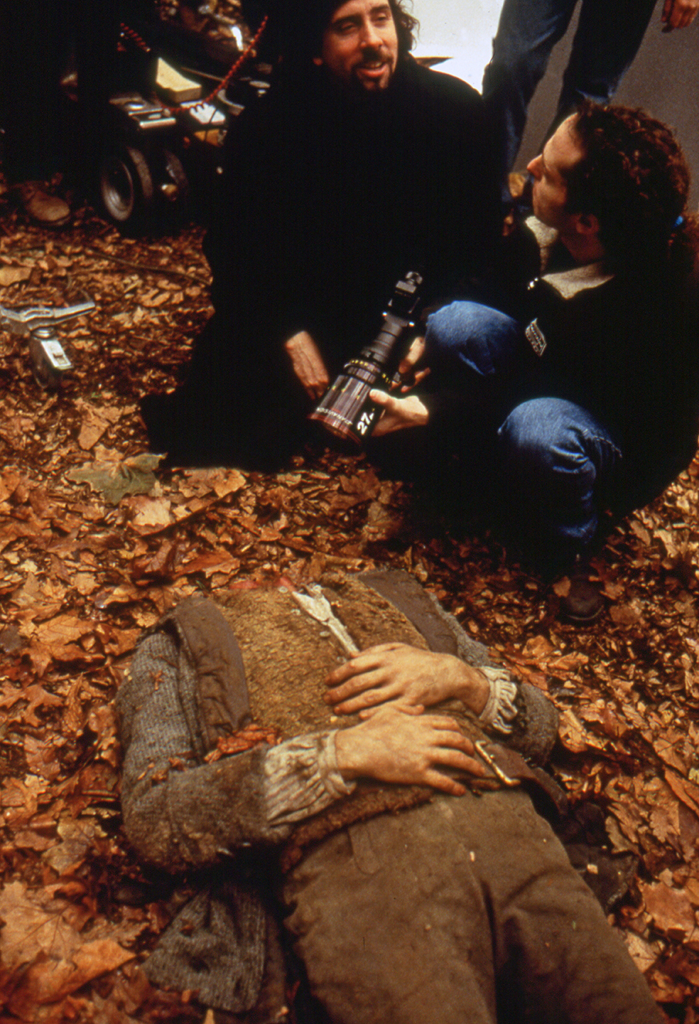
The cameraman chose to shoot with Panavision cameras equipped with Primo lenses. He used no filtration save for neutral-density, and kept the number of lens changes to a minimum. “We didn’t use a lot of lenses to shoot the movie,” Lubezki confirms. “The 40mm was our long lens; sometimes, when we just couldn’t get the shots that we wanted with the 40mm, we used the 50mm, and once or twice the 75mm. In general, though, the 40mm was our longest lens and the 21mm was our widest. The 27mm was our normal lens, and we also used the 35mm. In my opinion, when you start combining a lot of lenses, the look becomes a bit too rococo or baroque — there are too many different variations, and you lose something intangible. We wanted to keep the look of the film consistent.
“If someone who doesn’t know much about photography mentions grain, it means they’re perceiving it too much.”
“I definitely like using wider lenses, because they immediately put the actors in a context. I don’t like looking at anamorphic movies where they shoot the actors with a 180mm lens and the backgrounds go soft — you don’t know where you are. I like to show the characters in their environments; I think that enhances the story.
“In a funny way, though, that approach made our sets seem more limited,” he concedes. “To the eye, they looked big, but the reality was a bit different. Usually, your first instinct is to use a long lens to disguise those limitations, but on this film we wanted to audience to feel that the sets were slightly unreal. We wanted to create a hint of artificiality in the look, but not enough to take you out of the movie.”
To determine his ideal photographic aperture, Lubezki performed exposure tests on the sets, shooting at f-stops of 5.6, 4, 2.8 and 2. “I found that to increase the film’s pictorial quality, it was better to shoot almost wide-open,” he says. “The lenses were wide enough for me to feel the sets, but we didn’t want the sets to look too hard or harsh. We therefore shot the whole movie between 2.5 and 2.8. That was a first for me, because I usually shoot between 2.8 and 4. It was easier for me to light with a wider f-stop, though, because it became easier to see and judge the contrast by eye.”
The cinematographer opted to record the entire movie on one film stock: Kodak’s Vision 200T 5274. He explains that this decision was based on the filmmakers’ desire to enhance the look of the picture with Deluxe Laboratory’s Color Contrast Enhancement (CCE) process. “With the CCE process, you add a lot of grain, and I thought the Vision 500T [5279] was just too grainy. I love the texture of grain, though, and I think the grain [that the CCE added] works well, because the images have the quality of an old illustration. I don’t like it when the grain starts to become obtrusive, and the audience begins to feel it. If someone who doesn’t know much about photography mentions grain, it means they’re perceiving it too much.”
Developed by Deluxe’s vice president of technical services, Beverly Wood, and executive vice president of engineering, Colin Mossman, CCE is one of three silver-retention processes offered by the lab. According to Wood, “CCE is a proprietary process that produces a much higher contrast and adds more grain. When you have more silver [in the print,] you get a grainier look and blacker blacks. However, your black [values] can also plug up more. The matter of getting the color, the balance and the contrast right comes from the standpoint of density. CCE is different than the ACE process, which is adjustable; with CCE, the distinguishing factor in the answer-print process is that you can’t really adjust the blacks or the amount of desaturation. Our job at Deluxe is to get the look that Tim and Chivo want at the answer-print stage, and then maintain that same look when we make the dupe.”
“When we saw the dailies, though, everyone would say, ‘Wow, this is really dark and moody.’”
Lubezki notes that “from the beginning, Tim said, ‘If the studio would let me, I’d shoot this movie in black-and-white.’ But then we talked about it and he said, ‘You know, maybe not — maybe it’s better just to do it in color and keep everything very monochromatic, but still keep all of these shades of grey, dark blue, very dark brown and green.” He asked me if there was anything I could do in the photography to get that look, so we began talking with Beverly about different processes that would enhance the film’s contrast and desaturate the colors. We did a bunch of tests, like flashing and not flashing the film, and we decided to go with CCE, which was the process that would add the most contrast and desaturate the colors the most. Tim was always there when we did the process tests. It was a lot of fun to have him there, and we liked the same things, so we went with the CCE process.
“Once we decided on the look, we had a meeting with all of the departments, because CCE really affects the contrast and blacks in the images,” he continues. “Ian Robinson was our contact at Deluxe London, and we consulted very closely with him. The costume designer, Colleen Atwood, was doing a lot of stuff in black, but after the tests she began adding bits of silver and other enhancements to the texture of the clothes so we wouldn’t lose the details completely. With Rick Heinrichs, we would paint 8' by 4's with the colors he was planning to use for each set, and then shoot them, project the footage, discuss it and revise the colors. The color red was particularly affected by the process — it became really dark, sometimes so dark that it was almost black. We had to be really careful in the way we lit things. If you went into one of our sets while we were shooting, you’d have thought we were doing a soap opera, because everything looked really overlit. When we saw the dailies, though, everyone would say, ‘Wow, this is really dark and moody.’ You always have to factor in the effect that the process will have on the images. The first week of the show was miserable for me, and many many times I wanted to kill myself for deciding to work with the CCE process, but when you see the movie from start to finish, it looks really good.”
“One problem with using smoke was that sometimes, when we were working outside with our big cranes, the smoke would reveal where the light was coming from. That drove me insane...”
Asked to outline some of the problems he encountered with CCE, Lubezki offers, “The thing that’s really difficult about the process, which almost made me chicken out, is what it does to the actors’ skin tones. Because there’s so much contrast and the gamma curve is so steep, the skin tones can look blemished if you’re not careful. I don’t like to use much diffusion, and I usually don’t mind when you can see some imperfections in the actors’ faces — as long as those imperfections don’t take you out of the movie. On this picture, though, I wish I had used just a little more diffusion.”
Lubezki was also careful to monitor his use of smoke, which added some Hammer-like ambience and helped to reduce the dramatic contrast produced by the CCE. “There are some elements in the film that might be viewed as ‘cheap,’ such as the heavy use of smoke, but in a weird way, those elements help to make the images more beautiful and interesting,” he submits. “Using smoke also allowed us to get a consistent look for the movie. When all of the sets are smoked, you can’t tell what was done on a stage and what wasn’t. I didn’t want the light to be too baroque, with all kinds of backlights, kickers and little lights. Most of the lighting was created with very big sources, so you can’t really tell where the light is coming from.
“In the Western Woods set and at some of the other locations, you can definitely see the smoke — it looks like the fog they used in the old Frankenstein and Mummy movies!” he exclaims with a laugh. “Balancing the smoke therefore wasn’t much of a problem on the exterior sets, but it became really complicated when we used it in a smaller set like Ichabod’s room, where I didn’t want the audience to feel the smoke. It’s difficult, but after a week of using smoke you get a better feel for the proper level and how much is too much. Our use of smoke was also dependent on the CCE process. In our case, we could use more smoke, because we knew that the process would ‘see through’ it. The smoke affected the blacks, but the process also affected the blacks in the opposite way, so everything balanced out.
“Of course, if you’re going to use smoke, you have to live with the limitations,” he points out with a grimace. “One problem with using smoke was that sometimes, when we were working outside with our big cranes, the smoke would reveal where the light was coming from. That drove me insane, and I lost the battle a couple of times; in two or three shots, I had to beg the visual effects team at ILM to erase the light that was closer to the cranes, or to take the edge off.”
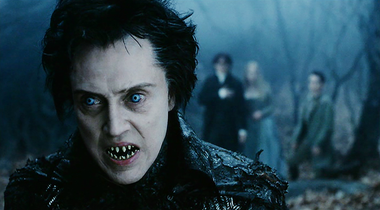
Another atmospheric touch was the use of “lightning flashes” whenever the Headless Horseman appeared in a scene. “Usually I hate lightning as an effect, because it has the potential to take the viewer out of the movie a bit,” Lubezki says. “If it’s supposed to be raining, it’s fine, but otherwise it can be a bit much. When we did tests with the Headless Horseman, though, we found that the lightning really added a lot of energy to the character — it made him more impressive, scary and Burtonian. Every time the Horseman is going to kill someone, the lightning appears as dramatic punctuation. The problem with lightning is that it really affects the editing of the movie. If it’s really fast-paced in one cut, and you go to a shot where the lightning doesn’t match, you start to feel this lack of freedom. It took us a while to learn how to keep it constant without obliterating the images with lightning. It looks really interesting when you’re shooting it, but you have to control yourself!”
Lubezki notes with a chuckle that the use of lightning gave Burton the chance to play God on the set. “I gave the Lightning Strikes control box to John Higgins, but Tim always told him when to cue the flashes — he would sit there and signal John by twitching his index finger. Since Tim would be so heavily involved in the editing, we felt that it would be best if he was responsible for the rate and speed of the lightning. I guess that’s one of the perks of being a big-time movie director!”
If you enjoy archival and retrospective articles on classic and influential films, you'll find more AC historical coverage here.